
You can use Q to smooth time series data in two ways: by adding a trend line to a Visualization chart, or by using Time Series charts. In this article, we’ll show you how to use both of these methods to plot and smooth your own data in Q.
The first approach is to add a trend line to a Visualization chart. If your data is already in a summarized form, this is typically the easiest method. However, if you are exploring raw data, you may find it easier to work with Time Series charts. These charts provide options for controlling the smoothing and data manipulation not available in visualizations. To illustrate these methods, we’ll be using the hospital.sav dataset, which contains patient survey responses as well as data on the times they entered and exited the hospital.
Setting up the date variable
Before beginning any analysis, it is important to ensure that the date variable is set up properly. In the Variables and Questions tab, make sure that Question Type is set to Date/Time. Ensure you also click the ellipsis in the Values column to check the aggregation unit of the date variable. For example, if you want to compute five-month moving averages, the aggregation unit should be in months.

1. Adding trend lines in Visualizations
The charts shown below are created by clicking Create > Charts > Visualizations > Line. Keep in mind that other chart types such as Area Charts, Bar Charts or Column Charts could be used instead. We can add trend lines by selecting the Chart tab in the object inspector, and adjusting the options under Trend lines.
Trend lines can be computed using four different methods: linear regression, LOESS, Friedman’s super smoother, or cubic splines. Each smoothing method uses the default parameters. Specifically, the span for Friedman’s super smoother and cubic splines are selected by cross-validation, and the default value of 0.75 is used for LOESS. As seen in the figure below, these values can have a strong effect on the shape of the trend line.

Example of data which must be converted into a time series.
In Visualizations, data input options are more complex in order to accommodate more types of charts. If your data is already summarized, you can skip these steps and insert the data directly into the chart. You may need to untick the checkbox for Aggregate data prior to plotting. If not, you may need to indicate that the data must first be converted into a time series. To do this:
- Select the variable of interest in Variables. If the variable is numeric, the mean will be shown on the y-axis; otherwise, counts will be used.
- Select the date variable in Groups. The aggregation will be determined by the aggregation unit selected here.
- Tick the checkbox to swap rows and columns.
2. Using Time Series charts
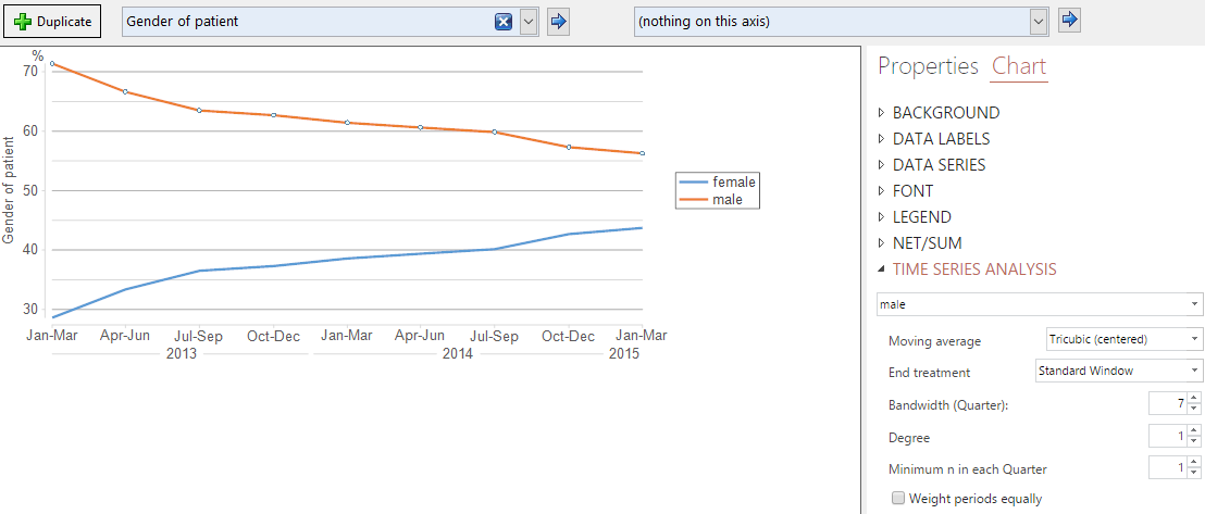
We can create a similar chart using Time Series plots. These are created by first creating a crosstab with the Question ‘Gender of patient’ in the blue box, and then clicking on the arrow next to Show Data as, which brings up a panel of charts (see figure below). Selecting the Time Series plot (bottom right icon) automatically aggregates the data according to the first date variable in the data set, producing a time-series plot.
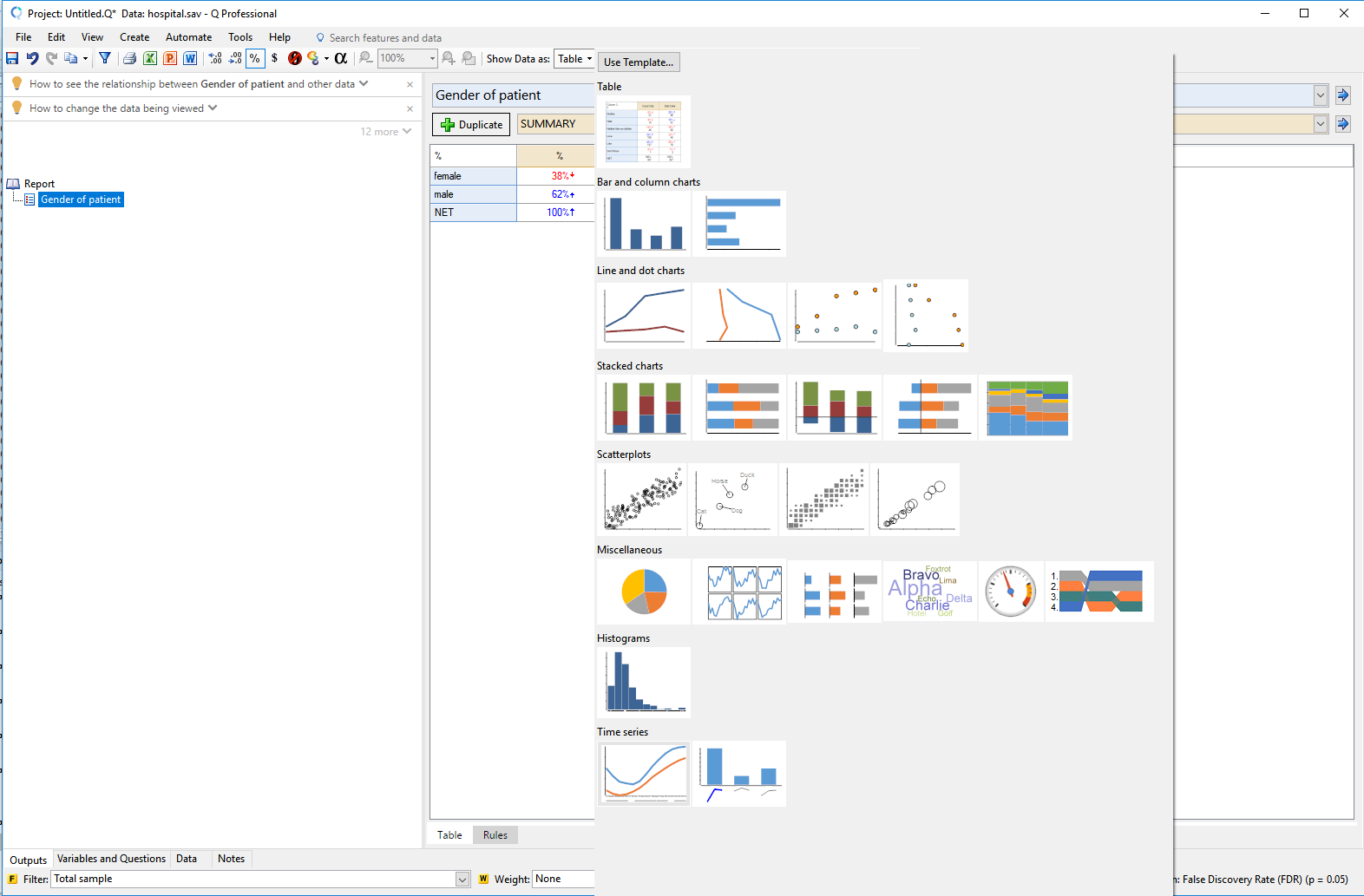
On the panel on the right-hand side of the screen (below), expand the options for Time Series Analysis, to change the smoothness of the lines in the chart. Unlike the Visualization charts, the time series chart does not show the unsmoothed data.

In the figure above, we changed the smoothing parameters to correspond to the LOESS defaults. That is, we used local quadratic regression (degree set to 2). We also used tri-cubic weights with a bandwidth of 7 data points. For this data set, these settings correspond to LOESS’s default bandwidth of 0.75 of the observed data.
To change the smoothing to behave more like Friedman’s super smoother, we set the degree to 1. This lower degree means that the large values observed in April 2014 are less influential, so there is a smaller bump. Note that Friedman’s super smoother uses cross-validation to identify the best bandwidth automatically, which is not possible in the Time Series charts.
Learn more about visualization, or check out more tips on using Q.