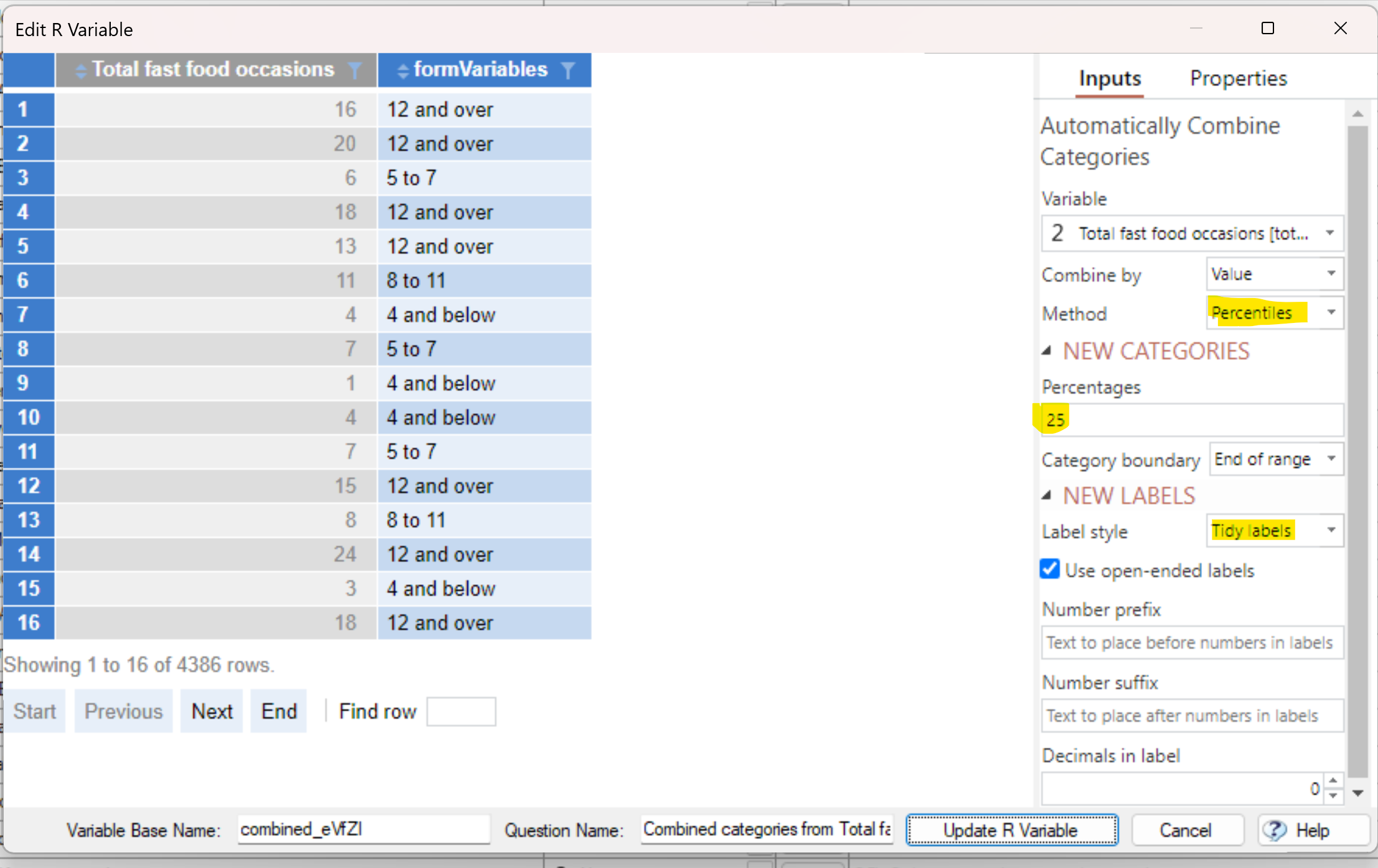
A common thing to do with data analysis is to categorize (i.e., band) some numeric data. Q now fully automates this via Automate > Browse Online Library > Create New Variables > By Value. You can choose to specify your own categories, percentiles, equally spaced categories, or “tidy” categories. By default Q will create two categories, but you can modify this and a host of other settings by right-clicking on the newly created variable and choosing Edit R Variable.
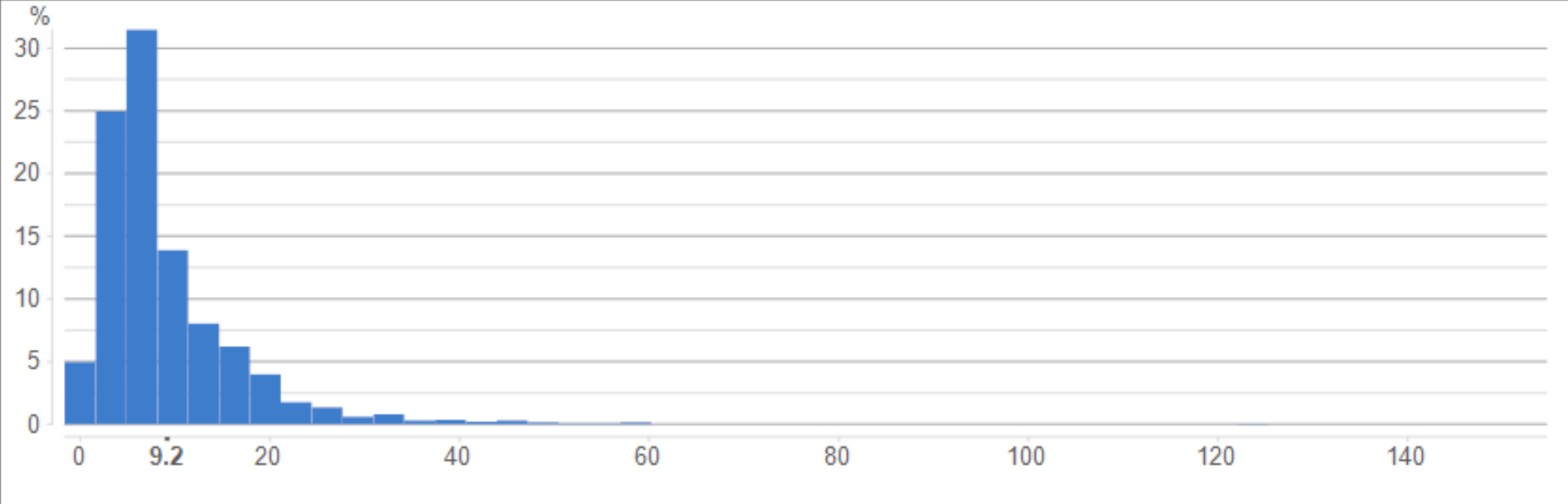
For example, the histogram below shows how many times people bought fast food in the previous month.
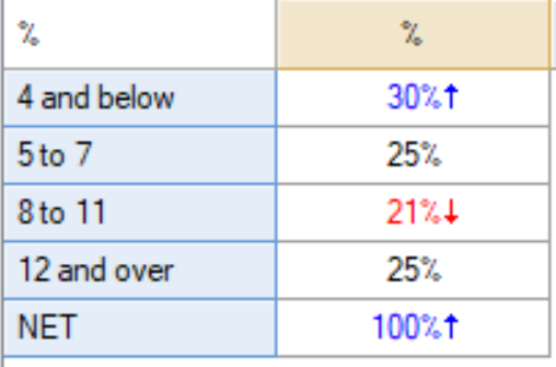
Below is a summary table showing the banded variable with quartiles. There isn’t exactly 25% in each category, as the data contains whole numbers.
To get it to do the quartiles, I chose Percentiles, specified the width to 25% (i.e., a quartile), and chose the Tidy labels setting, as shown below.