How to Do Filters, Banners and Stat Testing in Q
In this article, I show you how quick and easy it is to make all the tables you need for your report. I look at filters, banners, generating crosstabs, and automated significance testing. I explain the key points about these aspects of Q’s tables, and then I will give you a quick tutorial, so you can do them yourself. Read this post to start developing the toolkit you need to create your report in Q.
In the first Getting Started with Q article, I showed you how to create your first table. To generate a full report, you also need to know how to:
- Create and apply filters to get results for particular groups of interest.
- Create banners to show a breakdown of your results by many groups at the same time.
- Control how significance testing is displayed.
- Generate many crosstabs at once.
Generating tables for your report using Q is quick and easy. With just a few clicks you can create filters, banners, and churn out all the crosstabs you need. Significance tests are applied to your tables automatically, to help you pick out the most interesting results. No syntax writing is required. If you change your mind about any aspect of your data you can modify what you have created already, and your tables will be updated. There is never any need to start again. Follow the tutorial at the bottom of this post to see how easy it is to create your tables.
1. Filters
The filter function allows you to look at results for a sub-section of your data. Tables are filtered by choosing a filter variable from the Filter menu at the bottom left side in the Outputs tab. You can choose additional filters to drill-down further into the data.
Other analyses in Q can be filtered in the same way.
First, you need to set up filter variables which describe the parts of your sample that you want to include. You can add a filter to your report easily by finding a cell in a table or crosstab that matches the sample you want, right-clicking it, and selecting Create Filter. I’ll cover more on this in my tutorial below. For more on filtering in Q, see How to Filter Data in Q.
2. Banners
Several market researchers love banner tables. In Q, creating banners is a snap with the drag-and-drop interface. You can start your banner by selecting Create > Banner > Drag and drop…. From there all you have to do is drag the desired questions you want in your banner into place. Using this tool, you can arrange your banners to be nested…

or un-nested…
and all kinds of configurations in between. You can also define custom categories or segments for your banner later on by right-clicking the table and finding the banner in the context menu.
3. Significance testing
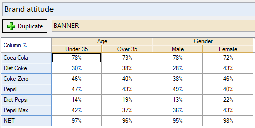
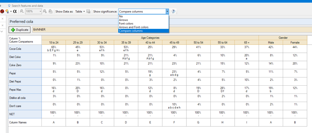
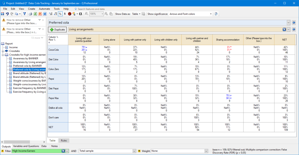
Q checks all the results in your tables for statistical significance automatically. Results that are found to be significantly high are highlighted in blue, while those which are found to be significantly low are marked in red. Q automatically chooses the most appropriate test for your table based on the data you have selected. For instance, the highlighting in this table indicates that people who say they are on a diet are significantly more likely to prefer Diet Coke and Coke Zero than the rest of the sample.
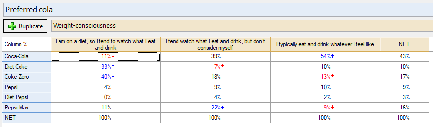
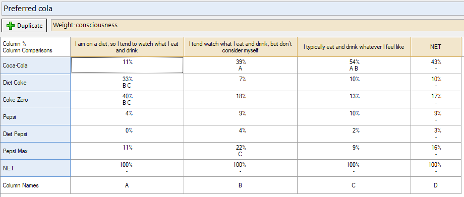
To compare results between columns, you can change the Show significance setting to Compare columns. Each pair of results in each row and column group will be compared. Each column in the table gets a letter as a label, and results which are significantly high will be marked with those letters. In this version of the table, the columns are compared directly, and we find a similar story.
4. Creating lots of crosstabs
Once you have your banner set up, you can quickly churn out all the crosstabs you need for your report by using Create > Tables > Lots of Crosstabs. All you need to do is choose which questions will be tabulated in the rows and columns of the tables.
Most things in Q can be multi-selected, and this includes the tables in your report. This means that once you have created your batch of crosstabs you can apply filters and weights, change statistics, and change settings for all the tables together by simply selecting all the required tables in your Report before applying the necessary changes.
Try it for yourself
To get a feel for how quickly you can create tables and crosstabs, try the following steps in Q.
Step 1: Open Q.
Step 2: Select File > Data Sets > Add to Project > From File.
Step 3: Find C:\Program Files\Q\Examples on your computer, select Cola Tracking – January to September.sav, and click Open.
Step 4: Click OK when prompted about setting up the data. Q will set up the data automatically.
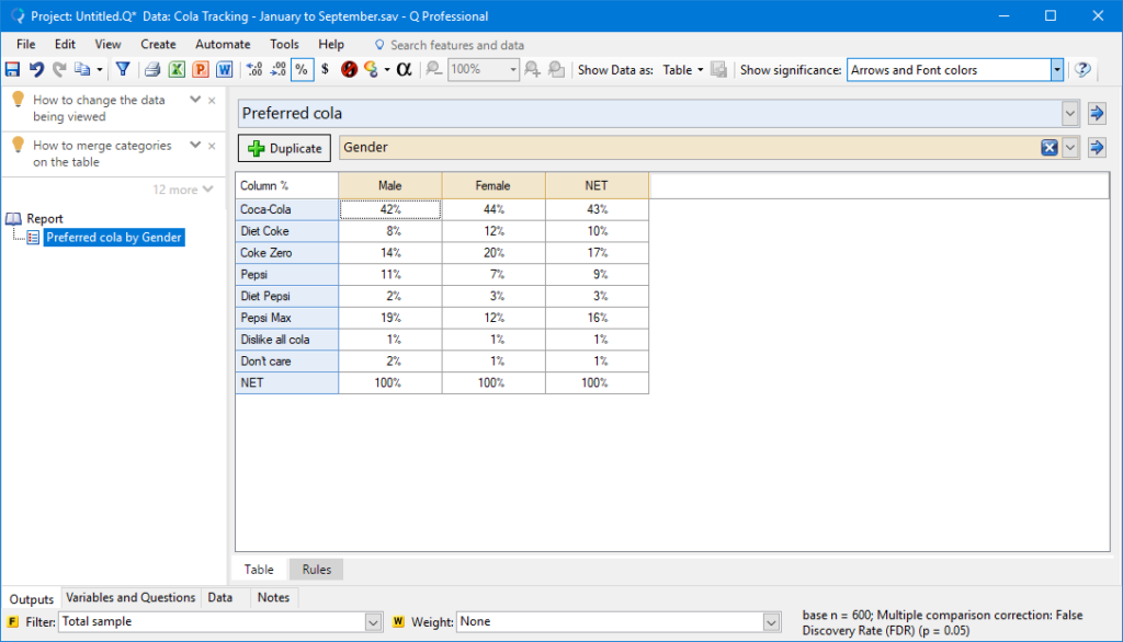
Step 5: In the Outputs tab select Preferred Cola in the Blue drop-down menu and Gender in the Brown drop-down menu.
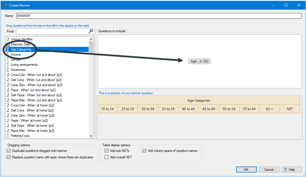
Step 6: Select Create > Banner. This opens up the banner creation tool, where you can drag and drop your questions to arrange the banner.
Step 7: Click-and-drag Age Categories from the list of questions on the left into the Questions to include box on the right. The banner preview will now show the age categories.
Step 8: Click-and-drag Gender next to age. Your banner preview will now show all age and gender categories side-by-side.
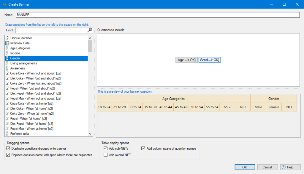
Step 9: Un-tick Add sub-NETs and click OK. Your table will now show the results for Preferred cola broken down by all of the age and gender categories.
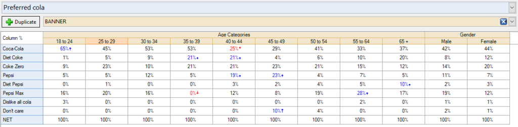
Results which are significantly high are marked in blue. Those which are significantly low are marked in red.
Step 10: If you prefer to conduct statistical tests between columns, change Show significance to Compare columns.
Step 11: Next we’ll use our banner and other questions to generate many crosstabs at once. This is much more efficient than generating them one at a time! Click Create > Tables > Lots of Crosstabs.
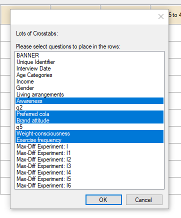
Step 12: Select these questions to place in the rows of the tables in your report and click OK: Awareness, Preferred cola, Brand attitude, Weight-consciousness, and Exercise frequency.
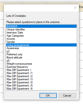
Step 13: Select these questions to place in the columns of the tables in your report, and click OK: BANNER and Living arrangements.
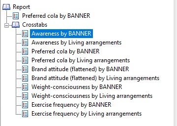
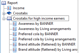
A new folder called Crosstabs is added to your report. It contains a table for each combination that you specified.
Step 14: Click back to the table at the top of your report. Change the question in the Blue drop-down menu to Income and change the selection in the Brown drop-down menu back to SUMMARY. We can use this table to create filters for different income groups.
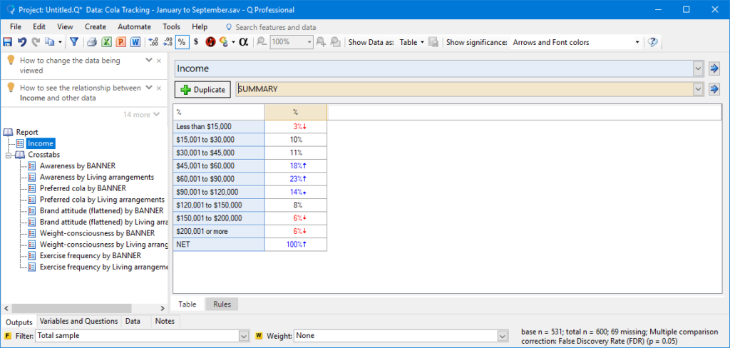
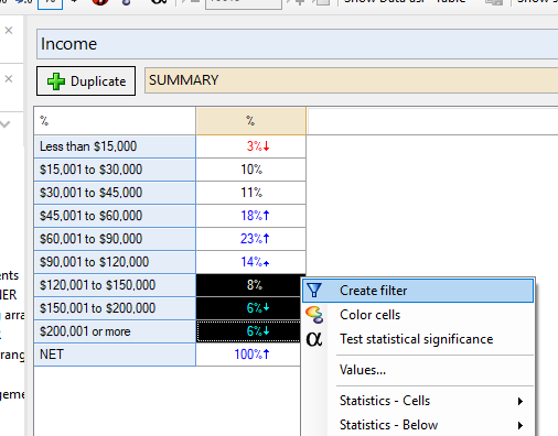
Step 15: Highlight the cells for $120,001 to $150,000 down to $200,001 or more, right-click and select Create Filter.
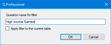
Step 16: Type in the name: High Income Earners and click OK. This will add a new filter variable to your project. It can be applied to any table or analysis.
Step 17: Right-click the Crosstabs folder and select Copy.
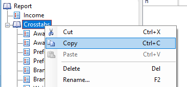
Step 18: Right-click the Report folder and select Paste. This will paste an entirely new copy of the Crosstabs folder into your Report. Copying and pasting is handy when you want to duplicate parts of your report for different sub-groups or segments.
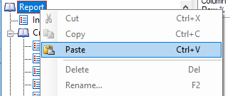
Step 19: Right-click on the new Crosstabs folder, click Rename, and call it Crosstabs for high income earners.
Step 20: With the folder selected, click the Filter menu below the table area and choose the High Income Earners filter.
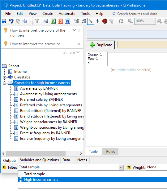
In this way, you can modify many tables at once. Now, if you click through tables in the Crosstabs for high income earners folder, you will find each has the filter applied – it shows up in green. The table statistics reflect the filtered data, and the table footer also tells you about the filtered sample.
So now you know the basic steps for creating the tables that you need for your report! In the next posts I will show you more on data visualization and advanced analyses.
Getting help
Whether you are a paying customer, doing a trial, or just want to ask a question about Q, you can reach our great support team at [email protected]. We’d love to hear from you!
If you’d like a one-on-one demonstration with a member of my team, click here to book.