New Ways to Visualize Your Data
Q understands how important visualizing data can be in finding and communicating the story you want to tell with your data. Q has a selection of ready-made, customizable, and easy to use charting features. In this post, I explore the built-in methods to visualize and chart your data (going way beyond what can be achieved in Microsoft PowerPoint).
As I showed you in the first Getting Started with Q article, you can create charts in Microsoft PowerPoint and Excel by exporting your tables. You can also create charts directly in Q to explore your data. You can export these to Microsoft Office, and Q has quite a few which you won’t find available in Office. Visualizing your data in Q can give you more options to effectively communicate your story and these features can help you work out what your story is in the first place.
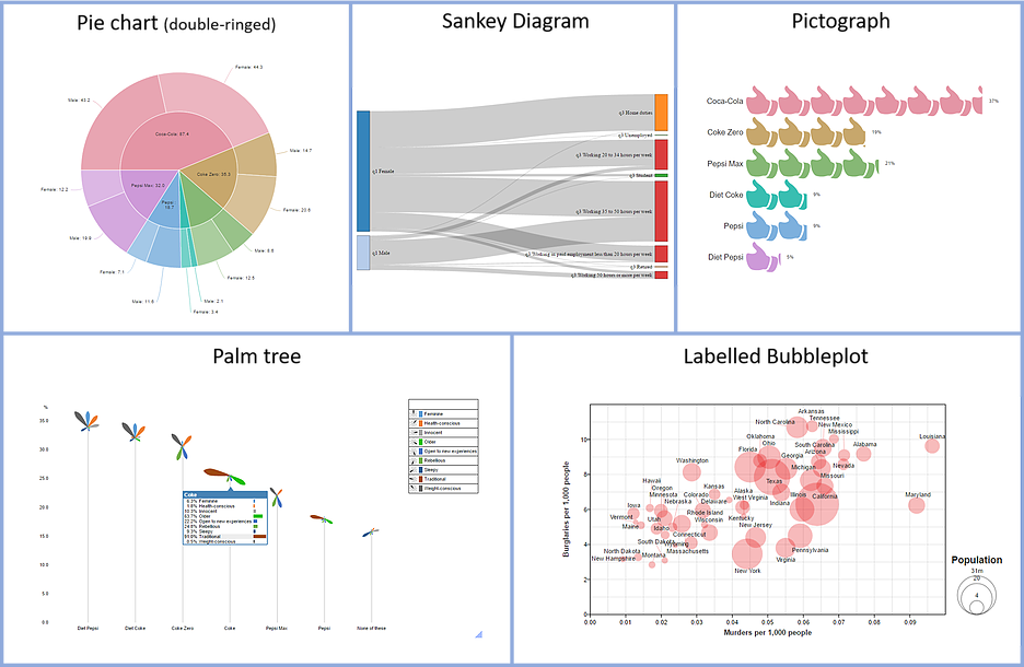
A handful of visualizations available in Q are shown below – there are many more of course for you to explore!
Charts and Visualizations
Q technically has two different ways to visualize your data: Charts and Visualizations. The basic difference is with charts you change the view from a table into a chart, whereas with a visualization, you hook it up to a source table (that is a separate object in the Report tree). I outline the process for each separately and then show some worked examples.
Charts
Charts are found under the Show Data As button in the Ribbon. The typical process is to:
- Make a table of the data you wish to turn into a chart
- Use the Show Data As: button to turn it into the desired chart
- Customize the design over on the right-hand side panel (called the Object inspector)
Below I give a tutorial in making a Ranking Plot and a Word Cloud.
Visualizations
Visualizations are made from the Create > Charts > Visualization menu. Making visualizations is also a simple process:
- Pick a visualization from the Create > Charts > Visualization menu
- Connect the visualization to some data (such as a table you’ve made, or perhaps to some variables)
- Calculate (using the Calculate button or Automatic toggle)
The visualization can then be further customized over in the Object Inspector. This includes how the visualization handles the data you’re feeding it, but also the design features. I show an example below of the Palm Trees visualization.
Try it for yourself
To get a feel for how quickly you can create charts and visualizations, try the following steps in Q.
Getting the project setup
Step 1: Open Q.
Step 2: Select File > Data Sets > Add to Project > From File….
Step 3: Find C:\Program Files\Q\Examples on your computer, select Cola Tracking – January to September.sav, and click Open.
Step 4: Click OK when prompted about setting up the data. Q will set up the data automatically.
Creating a Ranking Plot chart
Step 1: In the Outputs tab select Preferred Cola in the Blue drop-down menu and Age Categories in the Brown drop-down menu.
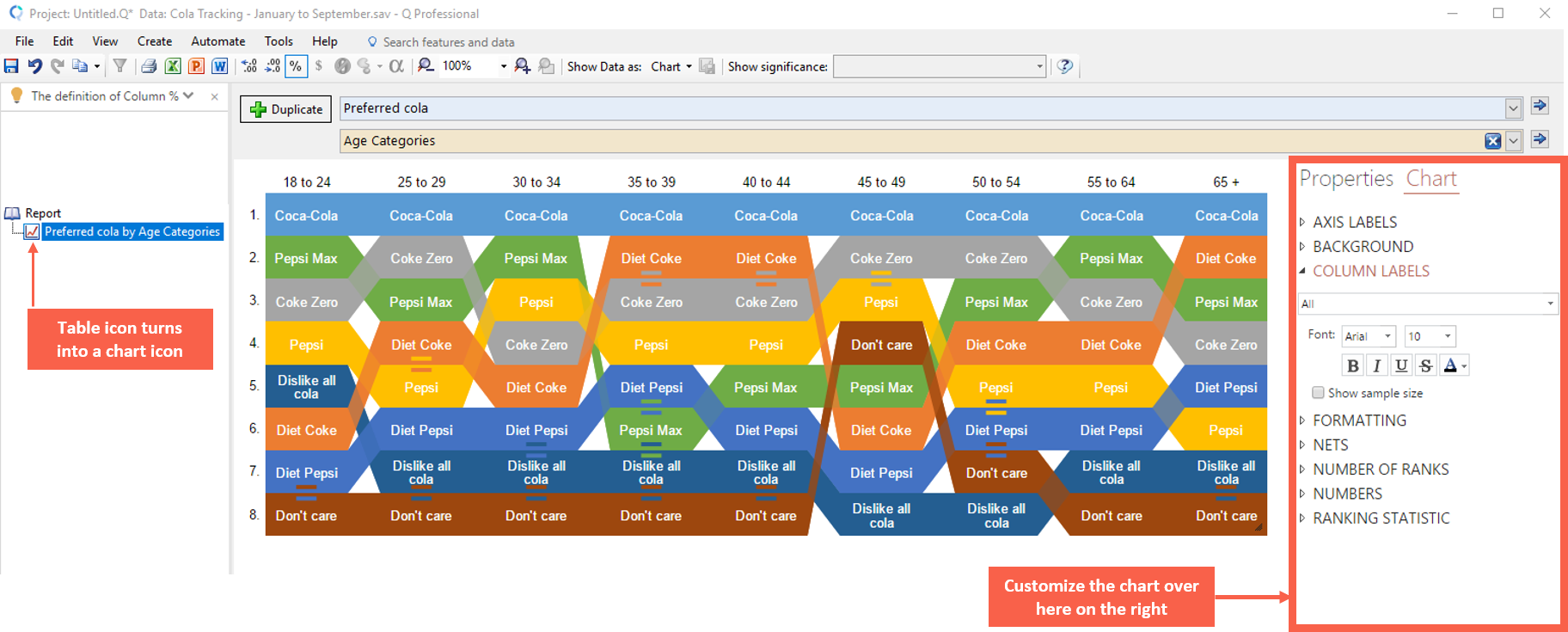
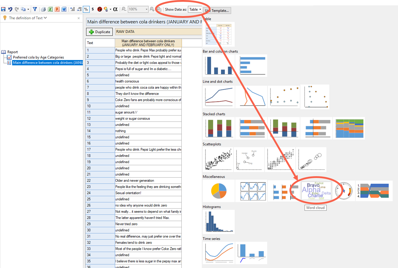
Step 2: Go to Show Data as: and select Ranking Plot (as per image below).
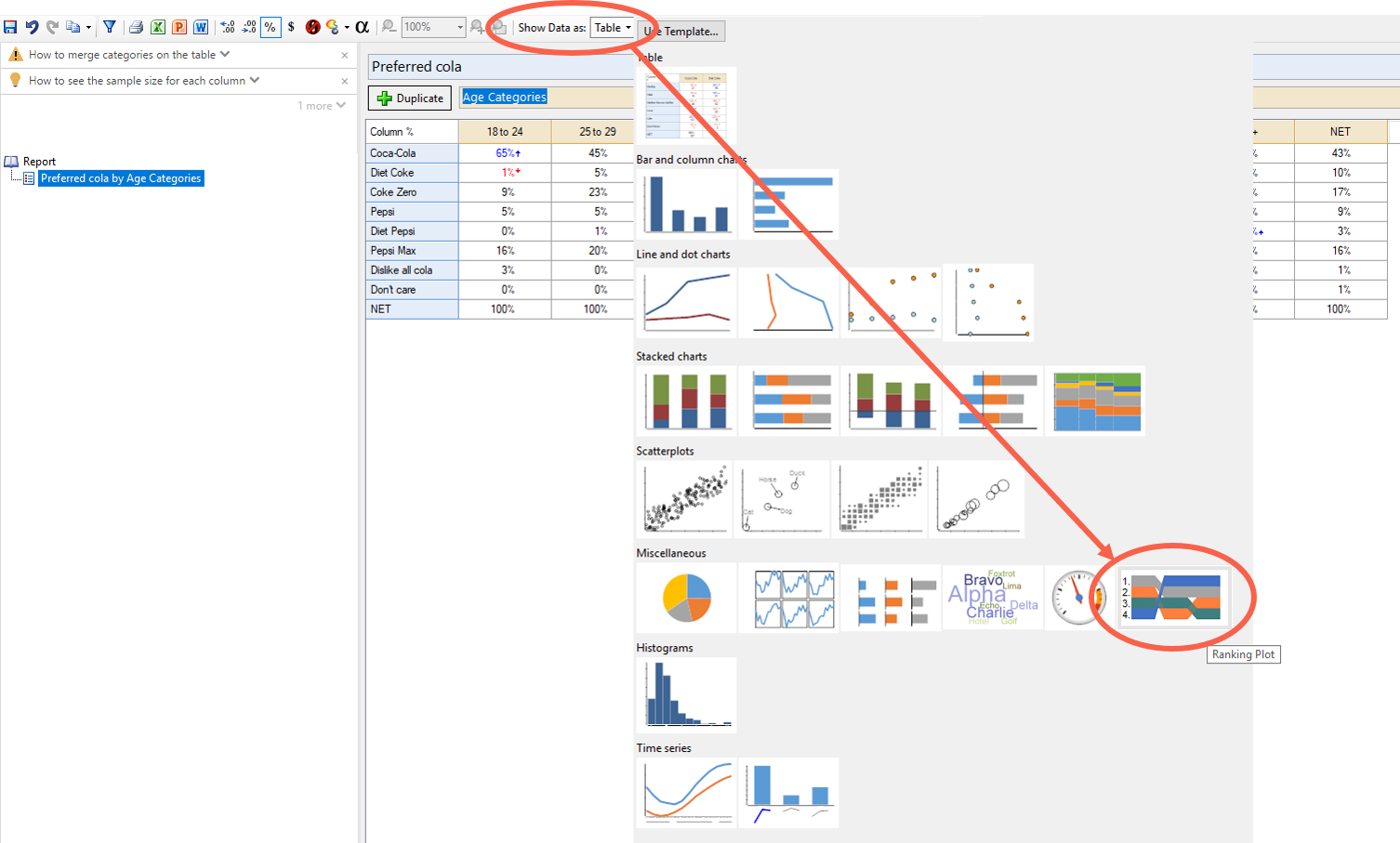
Step 3: Then, if you wish, customize the look over the ranking plot in the Object Inspector on the right.
Creating a Word Cloud chart
Step 1: In the Outputs tab select Main difference between cola drinkers in the Blue drop-down menu and RAW DATA in the Brown drop-down menu.
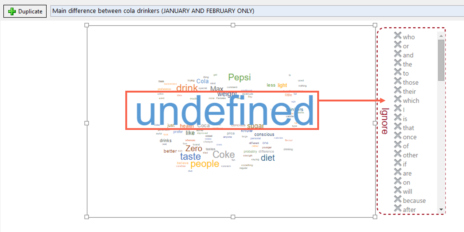
Step 2: Go to Show Data as: and select Word Cloud (as per image below)
Step 3: Customize your chart. In this particular chart, you also have drag-drop interactivity. For example, it’s prudent to drag “Undefined” to the Ignore window. You can also drag words on top of other words to group them. For example, Coke and Zero.
Creating a Palm Trees Visualization
Step 1: In the Outputs tab select Q5 in the Blue drop-down menu and SUMMARY in the Brown drop-down menu. This is a Pick Any – Grid question, so it has columns as part of the question. It’s a question examining brand image (brands associated with personality attributes)
Step 2: Go to Create > Charts > Visualization > Palm Trees.
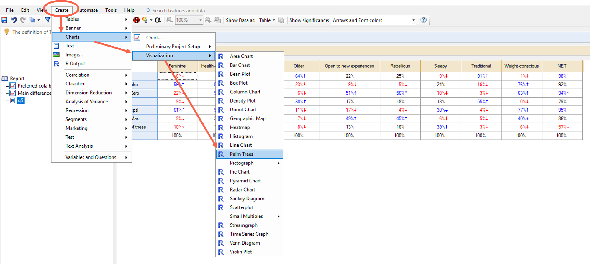
Step 3: Hook up the visualization (which is shown as a little R in the Report) to the source table (table.q5) using the panel on the right.
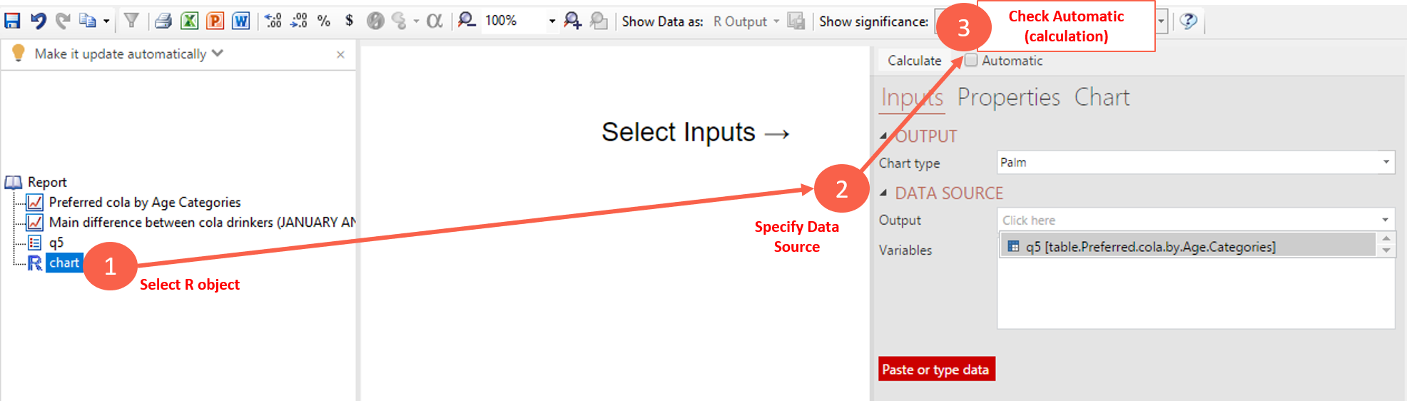
Step 4: Customize the visualization, in some key ways:
- Directly interacting with the visualization (e.g.: the legend)
- Using the Object Inspector on the right. You can manipulate how it interprets the source data under Inputs. You can manipulate the design (fonts, color palette, etc) under the Chart subpanel.
- Change the data in the source table (the visualization should update itself to reflect the change).

Getting help
To learn more about data visualization, check out our Webinar. You can also find more about these options in Q’s chart library and visualization library.
Whether you are a paying customer, doing a trial, or just want to ask a question about Q, you can reach our great support team at [email protected]. We’d love to hear from you!
If you’d like a one-on-one demonstration with a member of my team, click here to book.