
In an ideal world, visualizations should make the most important features of a data set obvious. But how to separate the systematic changes from the random noise? Add trend lines!
In Q, Visualizations of chart type Column, Bar, Area, Line and Scatter all support trend lines. You can compute trend lines using linear or non-parametric methods (Cubic spline, Friedmans’ super smoother, or LOESS).
Adding a linear trend line
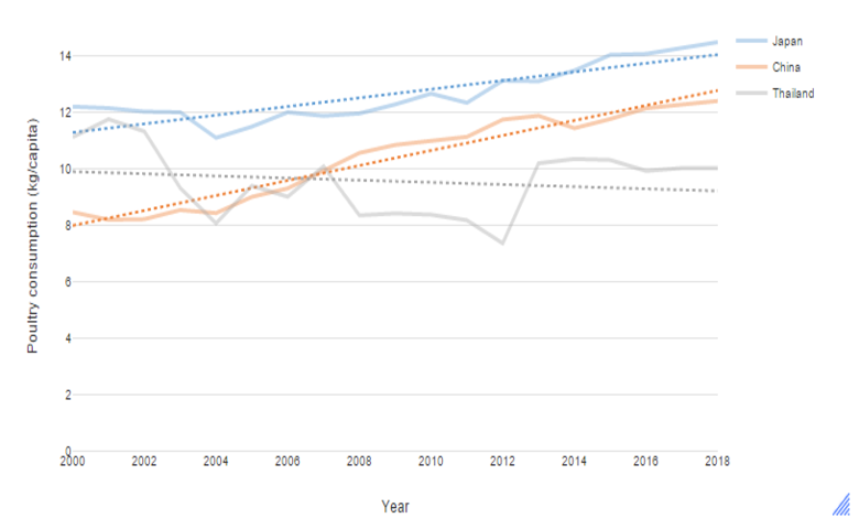
You can build a linear trend line by fitting an OLS regression to each data series. In the following chart, we see there are considerable changes in poultry consumption between years for each country; but the trend lines (dotted) clarify that in Japan and China consumption is increasing while in Thailand it is decreasing.
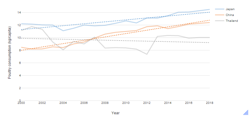
We created this chart in Q by selecting Create > Charts > Visualizations > Line. On the right of the screen, the object inspector shows the options for the chart. We inserted the data by clicking the Paste or type data button and pasting in the following cells. Note that instead of using the Paste or type data button, we could have used a different data source with a similar structure — such as a Q or R table — and entered it into the drop down menu for Outputs.
On the Chart tab in the object inspector, look for the Trend lines group. Set the Line of best fit dropdown to Linear. We have also ticked the checkbox for Ignore last data point. This option is useful for ignoring the last time period which may be incomplete if the data is in the process of being collected.
Trend lines using non-parametric smoothers
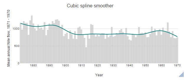
In many cases, we want to estimate a trend that is not constrained to a straight line. To estimate smooth trend lines, we can use cubic splines, Friedman’s super smoother, or LOESS. Note that LOESS uses a fixed span of 0.75, which may not always be appropriate. In contrast, the cubic spline and Friedman’s smoother uses cross-validation to select a span. They are usually better at identifying the important features. For example, in the figure below, the LOESS trend line suggests there is a gradual decrease in river flow from 1870 to 1910. However, both the cubic spline and Friedman’s super smoother pick up a sharp decrease around 1990.
How to Add Trend Lines
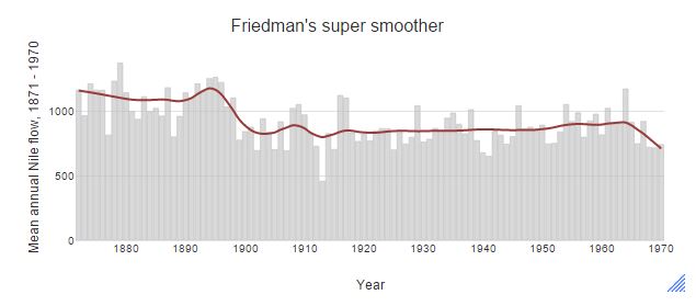

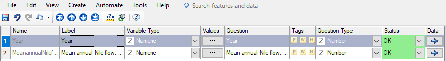
This example uses the Nile dataset; we downloaded it as a CSV from here (also available in R datasets). This can be imported into Q by selecting File > Data Sets > Add to Project > From file…. Click on the Variables and Questions tab to check that the data look like this:
To create the chart, we again select Create > Charts > Visualizations > Columns, but this time to insert a data source we use the dropdown labelled Variables from Data. From the dropdown, we select Year and Mean annual Nile flow (note that the date/numeric variable must be listed first). We also untick the checkbox for Aggregate the data prior to plotting.
Add trend lines by going to the Chart tab in the object inspector and selecting Friedman’s super smoother or LOESS for the line of best fit. Once this option is selected, you can customize the appearance of the line of best fit, under the Trend Lines group. You may also want to adjust the opacity or the color palette (under the Data series group) of the data (i.e., column bars).
To find out more about trend lines and other visualization techniques, check out the Displayr blog.


