

Knowing how to easily use the penalty analysis tool is an important part of every market researcher’s skill set. I’ll show you how you can use it in Q as well as how to visualize your results in four simple steps.
What is penalty analysis?
Penalty analysis is a tool used to work out which attributes of a product have the greatest effect on how much people like it. For example, if our product is a chocolate cookie, which of these attributes – crunchiness, flavor, or coating affect – have the biggest impact on how much people like the cookie?
Respondents are asked to rate how much they like the product, often on a 9-point scale. Then, respondents are asked about a set of specific attributes of the product and asked to rate them on the basis of ‘too much’, ‘just about right’, or ‘not enough’. As usual, these scales vary.
Penalty analysis calculations take this data and aim to work out which of the attributes cause the biggest drop-offs in how much people like the product when an attribute is “too much” or “not enough”. This is called the ‘penalty’. In this post I’ll show you how to do some common penalty analysis calculations in Q using R.
1. Prepare your data
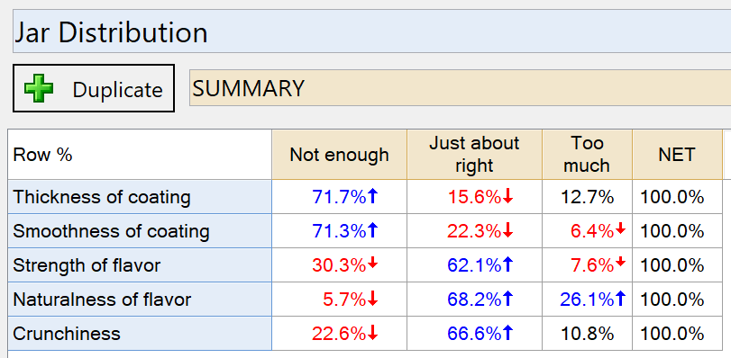
The variables for your just-about-right scale (JAR) must be combined as a Pick One – Multi question, and for this calculation they must be grouped as three categories. The order of the categories must be “Not enough” on the left, followed by “Just about right”, followed by “Too much”. The resulting table should look like the one below.
If your variables are not already combined:
- Select the variables in the Variables and Questions tab.
- Right-click and choose Set Question.
- Choose the Question Type as Pick One – Multi and click OK.
If your scale has more than three categories you may need to group them together:
- Highlight the column labels to group.
- Right-click and select Merge.
- Enter the appropriate name and click OK.
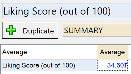
The “liking” scale should be set as a Number question, and the table should look like the one below.
If you need to change the Question Type, find the question in the Variables and Questions tab and change the Question Type drop-down to Number.
2. Create your ‘Just-About-Right’ table
All the statistics you need to compute the penalties can be created as follows:
- Select your Just-about-right scale in the Blue drop-down menu.
- Select your Liking score in the Brown drop-down menu.
- Right-click on the table and select Statistics – Cells, and ensure the Average and Row Population statistics are selected.
Your table should look like this:
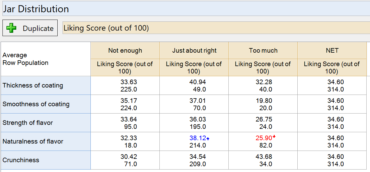
The Averages show the average liking score among people who consider each attribute “Not enough”, “Just about right”, and “Too much”. The Row Population shows the weighted sample size for each of these groups.
Finally, to make the calculations easier:
- Right-click the name of the table in the Report.
- Select Reference name.
- Change the reference name to jar.scores.
This determines how we can refer to this table of results when doing calculations in R.
3. Calculate the total penalty
Calculate the penalty by working out how much the average liking score drops between “Just about right” and “Not enough”, and between “Just about right” and “Too much”. These drops are weighted by the proportion of respondents in the “Not enough” and “Too much” categories and then added together to give the total penalty for each attribute.
To compute the total penalties we can use a little R code:
- Select Create > R Output.
- Paste in the code below.
- Click Calculate.
The code for the penalty is as follows
input.table = jar.scores
scores = input.table[,1:3,1,1] # Get the average scores
pops = input.table[,1:3,1,2] # Get the weighted sample sizes

sum.pops = rowSums(pops) # Compute the total sample for each row

# Work out the drops in average score between just-about-right and too much
# and just-about-right and not enough for each row. Values less than zero
# are set to zero
diff.low = rep(0, nrow(scores))
diff.high = rep(0, nrow(scores))
for (row in 1:nrow(scores)) {
   diff.low[row] = max(scores[row, 2] - scores[row,1], 0)
   diff.high[row] = max(scores[row, 2] - scores[row, 3], 0)
}

# Compute the proportion of the sample in the "not enough"
# and "too much" group  for each row
prop.low = pops[, 1] / sum.pops
prop.high = pops[, 3] / sum.pops

# Compute the penalties, weighted by proportions
penalty.low = prop.low*diff.low
penalty.high = prop.high*diff.high

# compute the total penalty
total.penalty = penalty.low + penalty.high
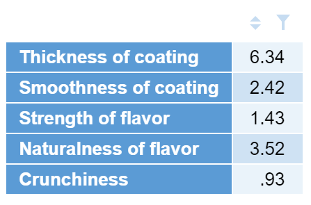
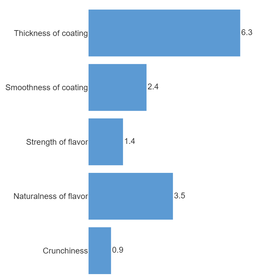
This will produce a table like the following, showing which attributes have the biggest penalty.
To make a visualization of this:
- Select Create > Charts > Visualization > Bar Chart.
- Select this table (called total.penalty) under Inputs > Data Source > Output.
- Tick Automatic.
- Select formatting options in the Chart section of the options on the right.
4. Chart penalty vs % of consumers
It is also important to consider the penalties in comparison to the proportion of the sample who regard the product as being “not right” according to each attribute. This is the percentage of people who rated each attribute as either “too much” or “not enough”.
For this calculation we scale each penalty by the proportion of people who rated that attribute as “not right”, and we plot this weighted penalty against that percentage.
To work out the proportion of respondents who rated each attribute as “not right” and calculate the weighted penalties:
- Select Create > R Output.
- Enter the code below.
- Click Calculate.
input.table = jar.scores
scores = input.table[,1:3,1,1] # Get the average scores
pops = input.table[,1:3,1,2] # Get the weighted sample sizes
sum.pops = rowSums(pops) # Compute the total sample for each row
# Work out the drops in average score between just-about-right and too much
# and just-about-right and not enough for each row. Values less than zero
# are set to zero
diff.low = rep(0, nrow(scores))
diff.high = rep(0, nrow(scores))
for (row in 1:nrow(scores)) {
diff.low[row] = max(scores[row, 2] - scores[row,1], 0)
diff.high[row] = max(scores[row, 2] - scores[row, 3], 0)
}
# Compute the proportion of the sample in the not enough
# and too much group for each row
prop.low = pops[, 1] / sum.pops
prop.high = pops[, 3] / sum.pops
# Compute the penalties, weighted by proportions
penalty.low = prop.low*diff.low
penalty.high = prop.high*diff.high
# compute the total penalty
total.penalty = penalty.low + penalty.high
# work out the percentage of people in either too much or not enough
not.right = prop.high + prop.low
# Scale each penalty by the proportion of respondents who rated that category
# too much or not enough
weighted.penalty = total.penalty / not.right
# Combine the two together
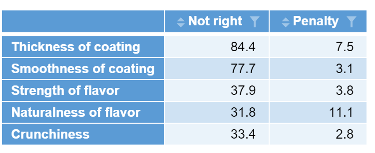
penalty.not.right = cbind("Not right" = not.right * 100, "Penalty" = weighted.penalty)
The resulting table will look like this:
To visualize the results:
- Select Create > Charts > Visualization > Scatterplot.
- Select this table (called penalty.not.right) under Data Source > Output.
- Select Chart > Show Labels > On Chart.
- Tick Automatic.
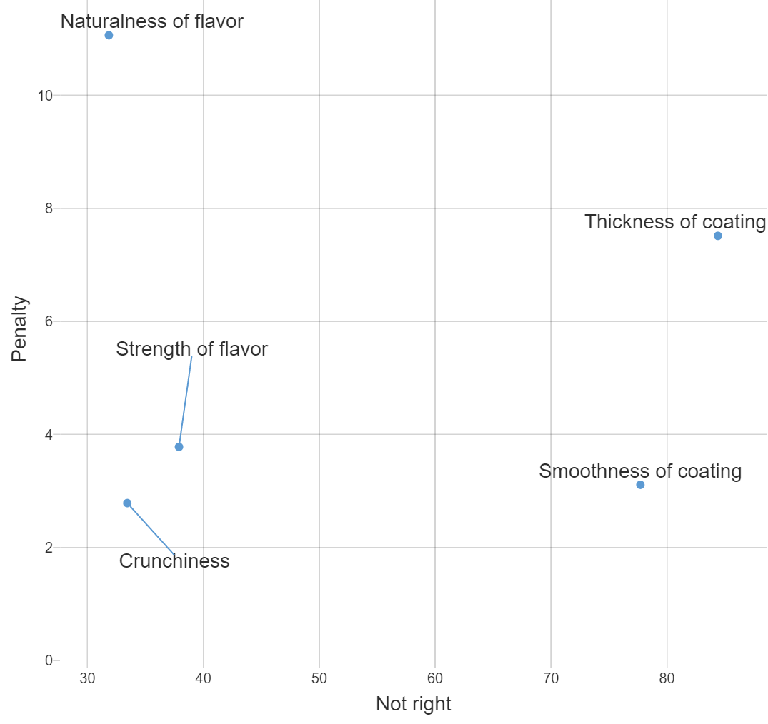
Product attributes which are top-most and right-most present the most concern as they both have a large drop-off on the liking scale and have the largest proportion of people who feel the product is “not right” in this area.
Check out more guides in the Using Q section of our blog.


