There are two separate methods for creating a bar chart in Q: using the built-in bar chart or the visualization menu. In many cases, these methods can be used interchangeably, although you many eventually develop a personal preference for one method over the other, depending on your workflow and data analysis process. Here we will look at how to create a bar chart in Q using both of these these methods.
Built-in charts
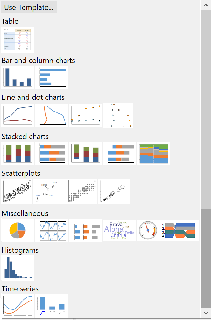
Q comes with a series of built-in charts that work by converting an existing Q table into a chart. These built-in charting options include bar and column charts, line charts, stacked charts, scatterplots, and much more!
These charts can be accessed by first selecting a table in Q and then, from the menus, selecting View > Show data as, and then selecting a chart type. This converts the table selected into a chosen chart type.
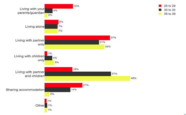
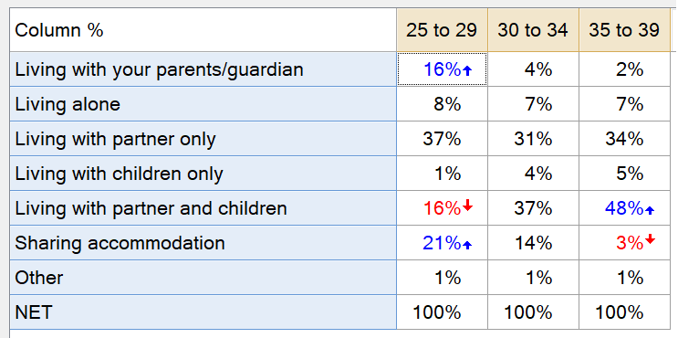
Before creating a bar chart using the built-in chart menu, we need to have a ready-to-convert table set up. For this example, we’ll use a simple table which shows respondent living arrangement cross-tabulated by age group.
With the table selected in the Report Tree, go to View > Show Data as > Bar Chart to change the table into a bar chart. Note that since the table is a cross-tab, Q will automatically generate a clustered bar chart. This will have the columns (ages) clustered together and the column labels displayed in the legend.
You can modify many of the common bar chart properties using the Object Inspector in the right pane. You can also modify the default chart color scheme using the Edit > Project Options > Customize > Chart (tab). If you wish to make changes to the underlying data in one of the built-in chart objects, you have to first turn the chart back into a table (View > Show Data as > Table), make the desired changes and then convert back to a chart. In general, these built-in charts have fewer available properties that can be modified compared to the charts created via the visualizations menu.
Visualization menu
The Visualization menu contains a wide range of charting options. The primary difference between the visualization menu charts and the built-in charts menu is that the built-in charts can only be created from an existing table whereas the charts created using the visualization menu can be generated from a table, specific variables or questions or pasted data. The visualization charts also have more options for modifying the chart properties. The visualization charts work a bit differently than the built-in charts.
To create a bar chart using the visualization menu, select Automate > Browse Online Library > Visualization > Bar Chart. You can also access this menu from Create > Charts > Visualization > Bar Chart. Q will create a chart object in the Report Tree and name it “chart” by default. Next, we need to provide the inputs for the bar chart in the Object Inspector in the right-hand pane.
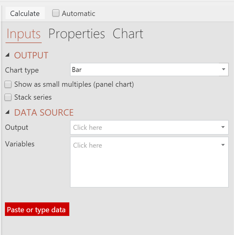
As noted above, there are multiple options for providing the input data to the chart:
- Output – select a table from the Outputs tab.
- Variables – select the individual variables to create the chart from.
- Paste or type data – paste the data into spreadsheet input tool.
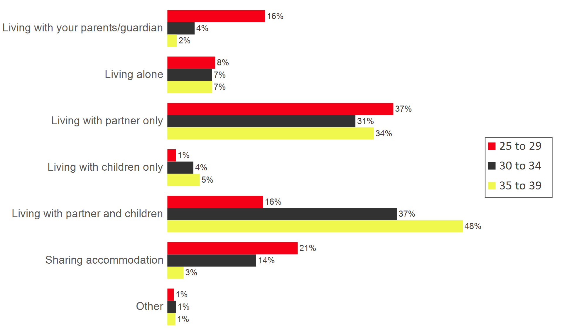
Here we will use the Output option and from the Output drop-down box, we select the table that we created above. Next, we click the Calculate button. The following chart is then created based on the input parameters provided:

As with the built-in charts, you can modify many of the chart properties using the Object Inspector in the right pane under the Chart section. Making changes is a bit easier using the visualizations menu option than it is with the built-in charts. This is because you can make changes to the source data table and then easily recalculate the chart object as needed. You can also tick the Automatic checkbox next to the Calculate button to force the chart to refresh whenever changes are made to the source data or chart properties.
We hope you found this article helpful! If you want discover how to do more in Q, check out “Using Q” or book a personalized demo now!