
Box plots are a tidy way to illustrate statistical properties of a set of numeric data. A box plot will typically show you the median value of the data, the range between the first quartile of the data and the third (interquartile range), and whiskers to help you judge outliers. In this post I show you how to make a box plot in Q.
Data setup
A box plot is one of the types of plot that needs to work based on raw data. The chart is doing math in the background to work out the quartiles, medians, and other properties. The variables for your box plot must be set up in questions with a Question Type of Number, Number – Multi, or Number – Grid.
In this post I will consider some survey data (collected many years ago), which includes questions asking the respondents how much time (in minutes) they spend watching TV, reading newspapers, listening to radio, and other activities. To check the Question Type setting is appropriate, I just need to locate the variables in the Variables and Questions tab. This is how they look:
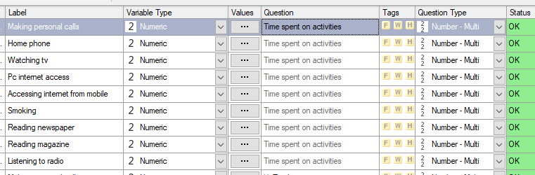
The variables that I want to use are grouped as a Number – Multi question, which is fine for my needs.
If your variables are not set up in the right way, you can:
- Highlight the rows of the variables.
- Right-click and select Copy and Paste Variables > Exact Copy. This makes a copy so you don’t need to worry about affecting the setup of the variables if you have used them in other tables or analyses.
- Click in the Question Type column and change the selection to Number.
Creating the Box Plot
A box plot can be created for one or more variables. To add the chart in Q:
- Select Create > Charts > Visualization > Box Plot.
- Click into Inputs > DATA SOURCE > Variables in the Object Inspector on the right of the screen, and select the variables that you want to analyze.
- Tick the Automatic box at the top. This tells Q to re-draw the chart any time your data changes or you change the settings.
The box plot for my variables appears like this:
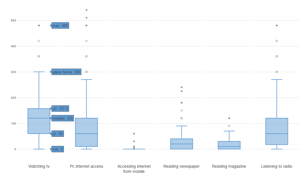
The labels appear when I hover my mouse. The elements of this chart are as follows:
- The box itself covers the interquartile range.
- The line in the middle of the box is the median value.
- Two bars extend from the top and bottom of the box. These are called the ‘whiskers’. The whiskers are drawn to the largest and smallest data point that are within 1.5 x the interquartile range.
- Dots are drawn to show data points which lie outside of the whiskers. These are typically considered outliers.
In this case, many respondents answered with values of zero, and values cannot be negative, so all of the plots have their lower whisker at zero. The activity with the highest median is watching TV. The activity with the outliers furthest from the median is PC internet access (a lot of heavy users). As this survey is many years old, “Accessing internet from mobile” was an activity most respondents spent little to no time on.
Grouping Box Plots
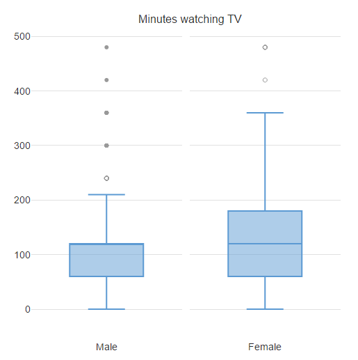
It is also possible to build a box plot which compares the distribution of data between groups of people in the data. This is done by selecting a variable in Inputs > DATA SOURCE > Groups in the Object Inspector.
For example, if I want to compare TV watching times between men and women in my data, I choose the “Gender” question to do the grouping. The resulting plot shows equal median value, but that women have a greater interquartile range.
Alternatively, you can create a box and whisker plot for free using Displayr’s box plot maker.