


A density plot is a smoothed histogram. Like the histogram, they are used to visualize the distribution of numeric values. A smoothing algorithm is applied to the actual data to estimate a shape of the distribution of the data.
They can be a lot more visually appealing than a histogram, and they don’t depend on a choice of the number of bins. In this post I show you how you can create density plots in Q.
Creating the density plot
In this example I have a data set which contains the heights of 1,000 people, measured in meters. To show the distribution of this data with a density plot:
- Select Create > Charts > Visualization.
- Click into the Variables box under Inputs > DATA source in the Object Inspector on the right, and select one or more variables to visualize. The variables you choose must be numeric, meaning that they should be from questions which have a Question Type of Number or Number – Multi. You can also use Paste or type data and use the spreadsheet interface to paste in some data from elsewhere if the data you want to visualize is not part of your survey data set.
- Tick the Automatic box at the top. This means that if your data set changes, or if you change filters or settings, the density plot will automatically redraw itself.
The density plot for the height data looks like this:
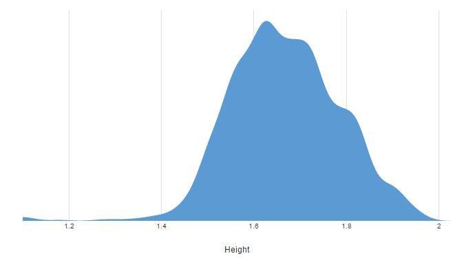
As mentioned above, this is an estimate of the distribution created with a smoothing algorithm (a topic for another day!). Even with only 1,000 people in the data, there’s no way the data really looks this smooth. In fact, if I make the height data categorical by changing the Question Type to Pick One and create a column chart, I instead get the following:
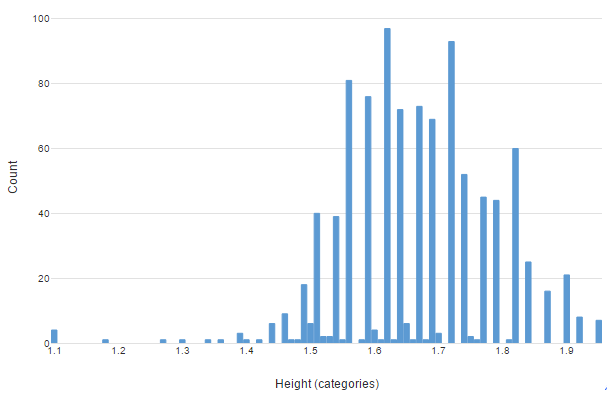
The real data is noisy, and even full of gaps. The density plot make it easier to get a picture of the overall shape.
Comparing between groups
When you use variables as an input you can split the density plot up and make comparisons between groups. For example, to compare the distribution of heights between males and females in the sample, I select the Gender variable in Inputs > DATA SOURCE > Groups. The result is a chart for males and a chart for females, with a common set of axes so that all the data is shown on the same scale (both horizontally and vertically).
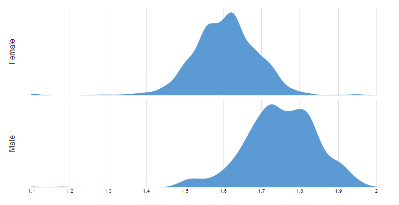
This makes for an easy comparison between groups, without the need to create multiple charts and worry about setting the axes up just right.
Tails
As density plots are based on estimates, they can sometimes show values outside of the normal range of the data. This is important to keep in mind when looking at these charts. For example, in both of the density plots shown in the previous sections, the right-hand tail of the chart extends beyond 2 meters. However, the largest actual value in the height data is only 1.95 meters. This is an artifact of the smoothing process.


