

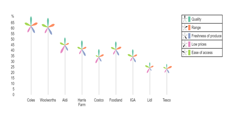
Palm trees are useful for visualizing multivariate data. They are particularly good at decomposing performance or scoring data. In such a case, the frond (leaf) lengths reflect the individual components of the overall score, The height of the tree represents the overall score.
The example above shows the percentage of people who rated specific supermarket brands as “good” on five different criteria. We can instantly see that, because of their greater tree height, the larger Australian supermarkets Coles and Woolworths perform better on average.
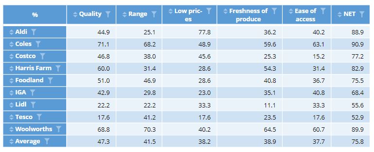
For more detail, we consider the score for each criteria encoded by the length of the leaves. It is difficult to read the actual values from the chart, but it is easy to compare the relative lengths. The compact representation also makes it easy to compare the configuration of scores across all five criteria at once. Both Coles and Woolworths score well across all 5 criteria, with Woolworths performing particularly well in terms of Freshness of produce. In contrast Aldi, Costco and Lidl focus heavily on Low prices.
The chart is also interactive. If you hover over a tree, you can see the numeric values for each category. Clicking on the legend, you can order the trees by value (ascending or descending), or alphabetically. We can also explore the effect of specific criteria by clicking on a frond, or on the legend. The height and the order of the trees will update automatically. For instance, clicking on a pink leaf shows that ignoring Low prices, Woolworths would have a higher average score than Coles.
Creating palm tree plots
The charts are created by selecting Create > Charts > Visualization> Palm Trees. There are three ways to enter data for palm trees.
- Output – select a table output. For a crosstab of two variables, the values in each column will be be shown as leaves of the same color. If you need to swap rows and columns, under Data manipulation, there is a switch rows and columns checkbox.
 The order of the trees can be changed interactively, but you may also want to control the default order of the trees and fronds. You can sort the table using options under Row/Column manipulations.
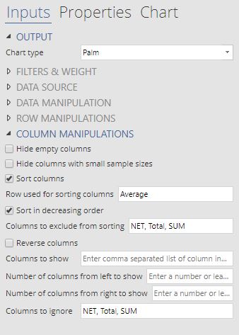
- Variables – analyse variables in the Data tree without creating intermediate tables. In particular, you can create a crosstab by selecting two variables and selecting the checkbox for Group by last variable (crosstab) under Data manipulations. However, it is often easier to create a table in a separate step and use option 1 instead.
- Paste or type data – opens a spreadsheet object for you to directly enter tabular data for this chart. This is the easiest way to copy data from a Excel spreadsheet.
Additional controls for customizing the color and axes can be found in the Chart tab of the Object Inspector.
Discover how you can create more visualizations in Q or book a free demo.


