

A pictograph bar chart uses multiple icons to represent the values in each bar. Pictograph bar charts can make a visualization more recognizable and interesting. They can be used for both count and proportional data.
Creating a Pictograph Bar Chart
A pictograph bar chart can be created by selecting Create > Charts > Visualization > Pictograph > Bar Chart. Similar to other visualizations, we can enter data for this in three different ways. However, unlike a standard bar chart, only one-dimensional tables will be shown.
- Output – select a table output. If a two-dimensional table is selected (e.g. a crosstab between two questions), you can specify a row or column to chart using the options under Row or Column Manipulations.
- Variables – select variables from your data sets without creating an intermediate table. Displayr will try to automatically summarize the data. For example, if a single variable is selected, a table showing the count of each value will be shown. If multiple variables are selected, a table containing the mean of each variable will be given. There are additional controls under Data manipulations.
- Paste or type data – opens a spreadsheet for data to be entered directly. This is particularly useful for copying data from Excel spreadsheets.
Representing the input data with icons
Options to customize the pictograph bar chart can be found in the Chart tab of the object inspector. The default setting are configured for count data. However, pictograph bar charts can also handle proportional data. In the example below, we set the total icons per bar to 10 and untick the checkbox to hide unfilled icons.
The number of icons filled depends on the input data and the units per icon (scale). For instance, in the soldier example at the top, each icon represents 100 soldiers. By default, the units per icon is set to the largest power of 10 that will give less than 100 icons for each category. This is to avoid problems if the input data has very large values. However, we note that in many cases setting the units per icon to 1 may improve readability.
Other customizations
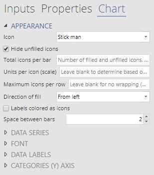 Icon layout can be customized when the number of icons is large. Setting the maximum icons per row will wrap the icons into multiple rows. In the first pictograph about soldiers, this option was set to 20. By default, the same amount of space is left for each category. However, the number of injured soldiers is much smaller than the number of dead or missing soldiers. To avoid having extra white space around injured soldier icons, we unticked the checkbox for fixed number of rows per bar.
Icon colors can be set for each category in the input data using color palettes (under Data Series). However, if custom icons are used, then url(s) must be provided for appropriate colored images.
Category labels for each bar can be customized with options found under Categories (Y) Axis. You can choose to show or hide these labels. You can also control the alignment, font family, font color and font size of the category labels. The position of the category labels (right or left of the icons) is determined by the direction of fill.
Data labels show the values in each bar. They can be positioned near the category labels (e.g. the the first pictograph about soldiers), or next to the bar (e.g. the second pictograph about tv series ratings), or below/above the icons. Prefixes or suffixes can also be added to provide extra information.
Alternatively, you can create a pictograph for free in Displayr using its pictograph maker.
Want to find out what other visualizations you can do in Q? Grab a free demonstration!


