One of the most basic and widely used visualizations is the pie chart which has been around since 1801! Pie charts are very effective when showing the response distribution or categorical proportions of a variable. They are, of course, less useful when making comparisons between groups. Still, the overall simplicity and effectiveness of a pie chart visualization makes it extremely useful. Here, we’ll explore how to create a pie chart in Q.
Creating a pie chart using the built-in charts option
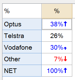
Q comes with a series of standard built-in charts that convert existing tables into charts. These built-in charting options include bar and column charts, line charts, stacked charts, scatterplots, and many more. To use the built-in chart option, we first create the data table that we want to visualize as a pie chart. The table below is from a sample data set and shows the distribution of cell phone providers within the sample.
We can now easily convert this table into a pie chart by selecting View > Show data as and then selecting the pie chart type (first chart on the Miscellaneous row).
This changes the table into a pie chart.
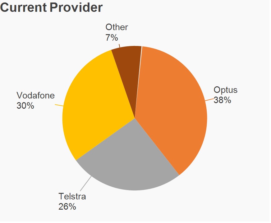
Note that I’ve modified some of the default settings (added a chart title, changed the color scheme, enlarged fonts, etc.) in the pie chart above. You can modify these properties by first selecting the pie chart in the Report Tree and then changing the attribute settings in the Object Inspector in the pane on the right-hand side of the screen. The chart color scheme can be modified by selecting Edit > Project Options > Customize > Chart (tab). To make changes to the underlying data in the pie chart, first turn the chart back into a table (View > Show Data as > Table), make the desired changes, and then convert the table back into a pie chart.
In general, the built-in charts have fewer available properties that you can modify compared to the charts created via the visualizations menu which we’ll explore next.
Creating a pie chart using the visualization menu
The Visualization menu has a wide range of charting options including the pie chart. The primary difference between the visualization menu charts and the built-in charts menu is that the built-in charts are created from an existing table, whereas with the visualization, the chart object is created and then inputs are generated from a table, specific variables (or questions), or pasted data.
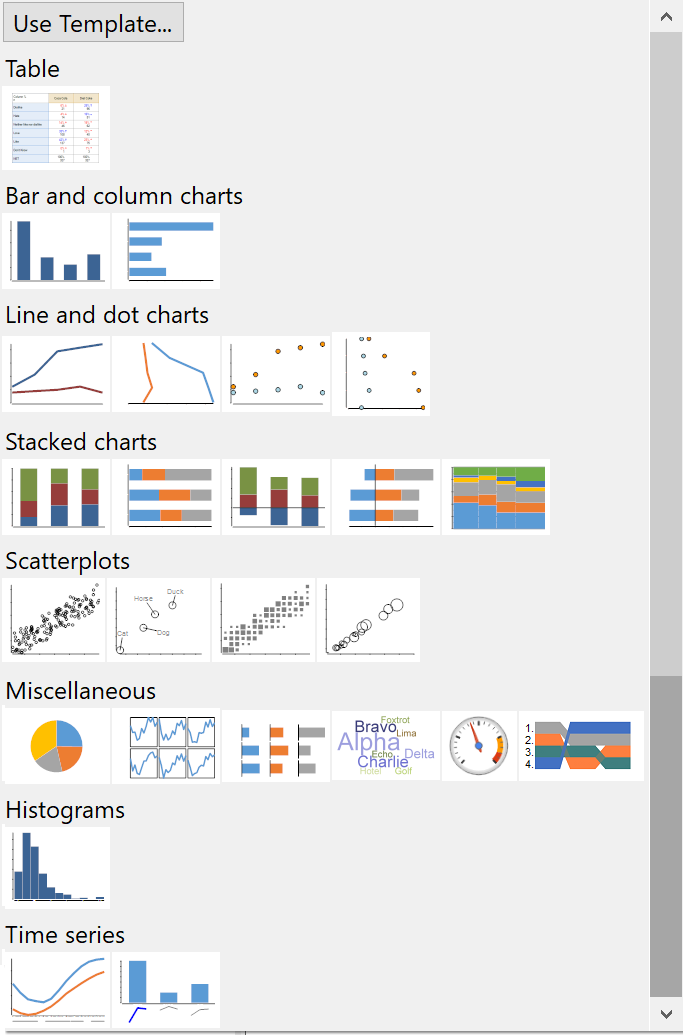
To create a pie chart using the visualization menu, select Automate > Browse Online Library > Visualization > Pie Chart. You can also access this from Create > Charts > Visualization > Pie Chart. Q will create a pie chart object in the Report Tree and name it “chart” by default. Next, we will provide the inputs to the pie chart in the Object Inspector in the right-hand pane.
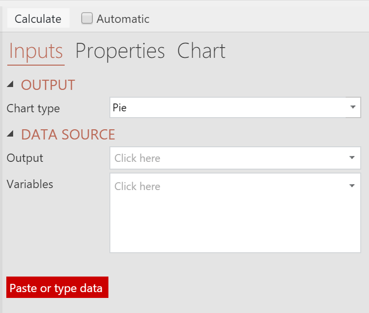
There are three different methods for providing input data to the pie chart:
- Output – select a table from the Outputs tab.
- Variables – select individual variables from your data set.
- Paste or type data – paste the data into spreadsheet input tool.
For this example, we’ll use the Output option and select the Current Provider table from above. Click the Calculate button to generate the pie chart.
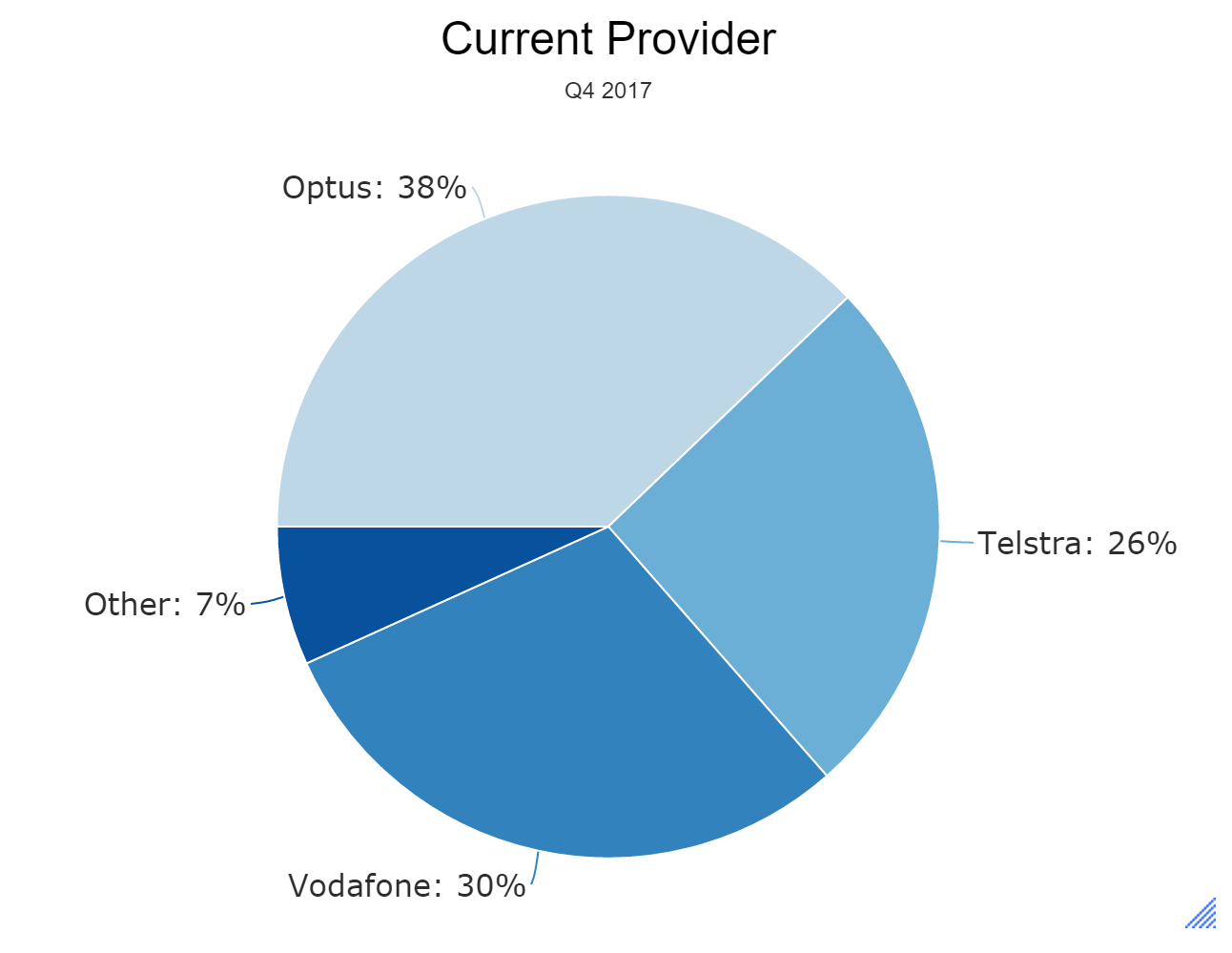
I’ve again modified several of the default chart settings including the title, sub-title, color scheme, label font, etc. You can modify these properties using the Object Inspector in the right-hand pane in the Chart section. Making changes is a bit easier using the visualizations menu option than it is with the built-in charts. For instance, you can alter the source data table and then easily recalculate the chart object as needed. You can also tick the Automatic checkbox next to the Calculate button. This will cause the chart to be refreshed whenever changes are made to the inputs or the chart properties.
Charting multiple variables
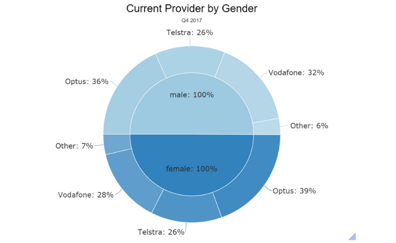
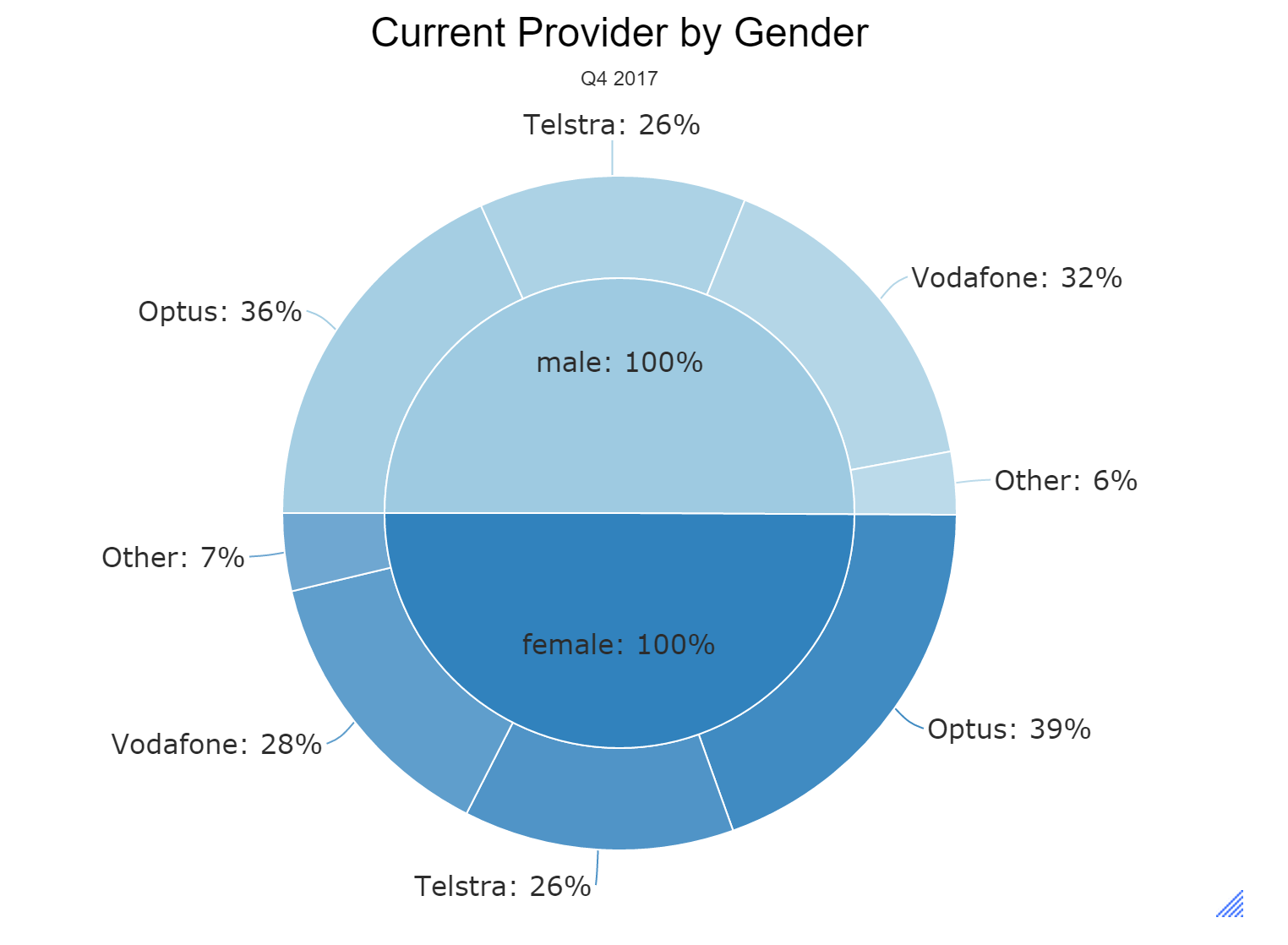
When using the pie chart visualization you can also chart multiple variables. In the example below, I’ve created a table showing current provider by gender and then used this table as an input to the pie chart visualization. This generates the following pie chart which shows current provider within each gender category.
We hope you found this article helpful! If you want discover how to do more in Q, book a personalized demo now!