A Pyramid chart is a bar chart where the bars grow out from the center, rather than from the left or right. Pyramid charts are a nifty alternative to bar charts, and are especially popular for representing results from funnels (like brand funnels or website conversion funnels).
Funnels have a natural, built-in order to them, with each result necessarily smaller than the previous. The symmetry of the pyramid chart looks like a funnel – or an upside down funnel, depending on which way you want to set it up! In this post I show you how to create pyramid charts, a.k.a. wedding cakes or funnels, in Q.
Data setup
The need to set up the data you want to visualize as a table. Some typical metrics that you can consider for a brand funnel are:
- Awareness – what proportion of people are aware of a brand?
- Consideration – what proportion of people would consider purchasing a product from the brand?
- Main brand – what proportion of people purchase from this brand and consider it to be the main brand that they use?
In a questionnaire, this data comes from a few different questions. Since the data for our pyramid must be in a single table, we’ll have to do some wrangling. For steps and examples of how to do this, please see How to Build a Brand Funnel in Q Using R.
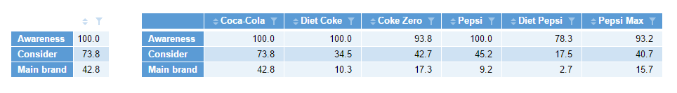
Your table can contain results for a single brand, or you could include several brands together. Here, I use the example of awareness, consideration, and main brand for cola brands. In the table on the left I look at a single brand, and in the right-hand table, multiple brands.
Creating the pyramid chart
To create the pyramid:
- Select Create > Charts > Visualization > Pyramid Chart.
- Click into Inputs > DATA SOURCE > Output in the Object Inspector on the right, and choose the table of numbers that you want to visualize.
- Tick the Automatic box at the top right. This ensures that whenever you change the source data or the options. The pyramid will redraw itself to show the latest version.
- Change the options in the Chart section of the Object Inspector to your liking.
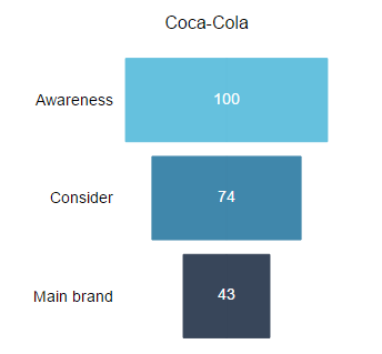
With the single-column input, I get a funnel like this:
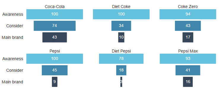
Small multiples
When you have results for a range of brands (or products or something else), then you can use what is called a small multiples chart to show the results in separate panels of the same chart. This has the advantage of allowing you to keep the sizing, scaling, and formatting of your funnels consistent using only a single set of options. To learn more, see What are Small Multiples? Many of the charts in Q’s Visualization menu have a small multiples option available.
To create pyramids for all cola brands at once, use the same options as above, but this time choose the table which contains all the data, and then click Inputs > OUTPUT > Show as small multiples (panel chart). The result is the chart below:
Want to find out how to do more in Q? Simply check out the rest of our blog!