
How to do Traditional Correspondence Analysis in Q

Correspondence analysis is a data analysis technique which summarizes the patterns in a table of data as a visualization. Tables with more than a handful of rows and columns can often become difficult to read, and the patterns can get hidden among the digits. Correspondence analysis can make it much easier to see the story of the data.
Get your free Correspondence Analysis eBook!
There are a few variations on the technique of correspondence analysis (like correspondence analysis of square tables, multiple correspondence analysis, and correspondence of multiple tables), but in this post I focus on the most common technique, which could be called traditional correspondence analysis. This is a technique originally derived to understand the patterns in contingency tables, but it can readily be applied to other kinds of data as well. In this post, I show you how to set up your correspondence analysis in Q.
Like all data analysis, there are a range of issues to keep in mind as you conduct your analysis and interpret the results. For a deep dive on the topic area, I recommend you check out our eBook and other posts on the topic.
Create your table
The starting point of your analysis is the table of data that you want to analyze. While the original application of correspondence analysis was for contingency tables of counts, the technique works effectively for a range of other kinds of data as long as the data is all on the same scale. This includes crosstabs showing counts, percentages, or averages, multiple-response grids (Pick Any – Grid), and even raw numeric data.
To create your table:
- Add data to your project using File > Data Sets > Add to Project.
- Select the desired Questions in the blue and brown drop-down menus.
- Select the statistic that you want to analyze by right-clicking your table, selecting Statistics – Cells, and choosing a single statistic from the list.
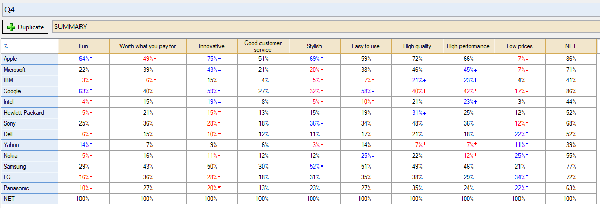
In this post, I will use the example of a brand-image grid of attributes for a range of technology brands, which is a Pick Any – Grid question in Q.
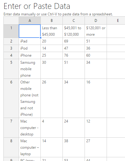
Alternatively, if you have a table of data already computed (say in a spreadsheet), rather than raw data, you can paste it directly into your project. This is a handy way of supplementing your existing report with results that have been obtained elsewhere. To paste a table into your project:
- Select Create > Tables > Paste Data.
- Select Paste or type data from the Object Inspector on the right side of the screen.
- Paste in your table of numbers into the spreadsheet interface (as below) and click OK.
- Click Calculate .
Both kinds of tables can then be used in the correspondence analysis in exactly the same way.
Get your free Correspondence Analysis eBook!
Run your analysis
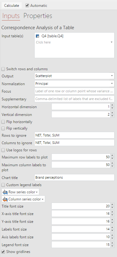
Now, you can add a correspondence analysis output to your project:
- Select Create > Dimension Reduction > Correspondence Analysis of a Table.

- Click into the Input table(s) box in the Object Inspector on the right, and select the table you created above.
- Tick Automatic. This ensures the analysis will re-run itself whenever the input data or options change.
- Remove any additional rows which correspond to ‘nets’ or ‘totals’ by adding the corresponding row/column labels in the Rows to ignore and Columns to ignore sections on the right. You should typically exclude these from analysis and Q automatically removes the default ones.
- Customize your title, colors, fonts, and grid lines using the settings on the right.
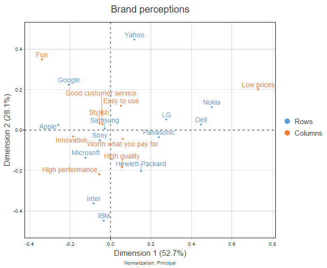
The map will appear like this in your report.
Moon plot
A nice alternative to the standard scatterplot output of correspondence analysis is the moonplot. You can display a moonplot by changing the Normalization to Row Principal, and changing the Output option to Moonplot on the right. The moonplot for my brand image grid looks like this.
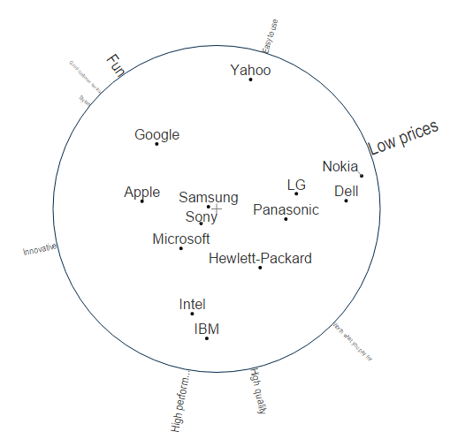
The moonplot shows the rows of the table (the brands in this case) in the center, and the column of the table (in this case the attributes) around the edge of the circle. For reasons explained in Moonplots: A Better Visualization for Brand Maps, the moonplot can be easier to interpret than the standard chart.
Exporting
You can export your correspondence analysis scatterplot or moonplot as an image to PowerPoint or Word using the export icons in the top toolbar.
Alternatively, you can export the underlying coordinates to draw your own chart in office. To do so, click one of the export icons, and change the Format setting to To Excel, and click OK.


