How to Export Updatable Text to PowerPoint from Q

Most Q users would be familiar with Q’s PowerPoint export options. The normal option allows you to export your tables to PowerPoint and create charts that are editable and updatable, using the Office chart template system. But, did you know you can also export text to PowerPoint in a way that is updatable? This means you can add text boxes to your presentation which describe key results, and you can update these when you get your next wave of data. In this post I show you how to set it up.
Creating dynamic text
You can format and prepare text in Q using an R Output. Q’s integration with the R language allows you to connect data from tables and variables to your own calculations. Yes, there is some code-writing involved, but for preparing text it’s really easy!
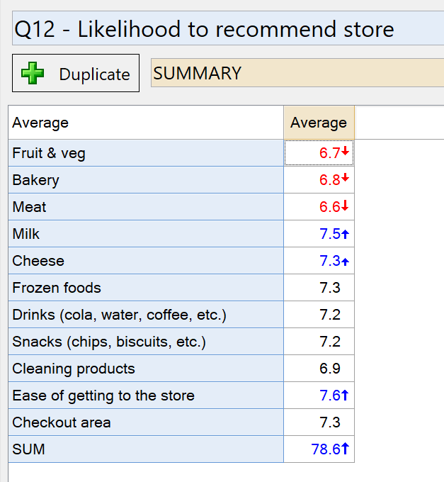
Let’s begin with an example. I have a survey data file from a study on shopper’s supermarket preferences. One of the questions asks how likely the respondent is to recommend their main store based on the different departments (bakery, frozen foods, checkout, etc). I’ve created a table showing the average scores for each department (on a 0 – 10 scale), and I have filtered the table according to people whose main store is Woolworths. The table looks like this:
If I want to create a text box in my PowerPoint report which tells me the latest score for the bakery department at Woolworths, I can use the following:
- Right-click on the table as it appears in the Report tree, and select Reference Name.
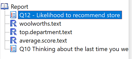
- Change the reference name to something that’s easy to remember. This will make it easier to refer to this table when writing code. In this case I change it to: woolworths.scores
- Select Create > R Output.
- Click into the R CODE box in the Object Inspector on the right side of the screen.
- Enter the code from below.
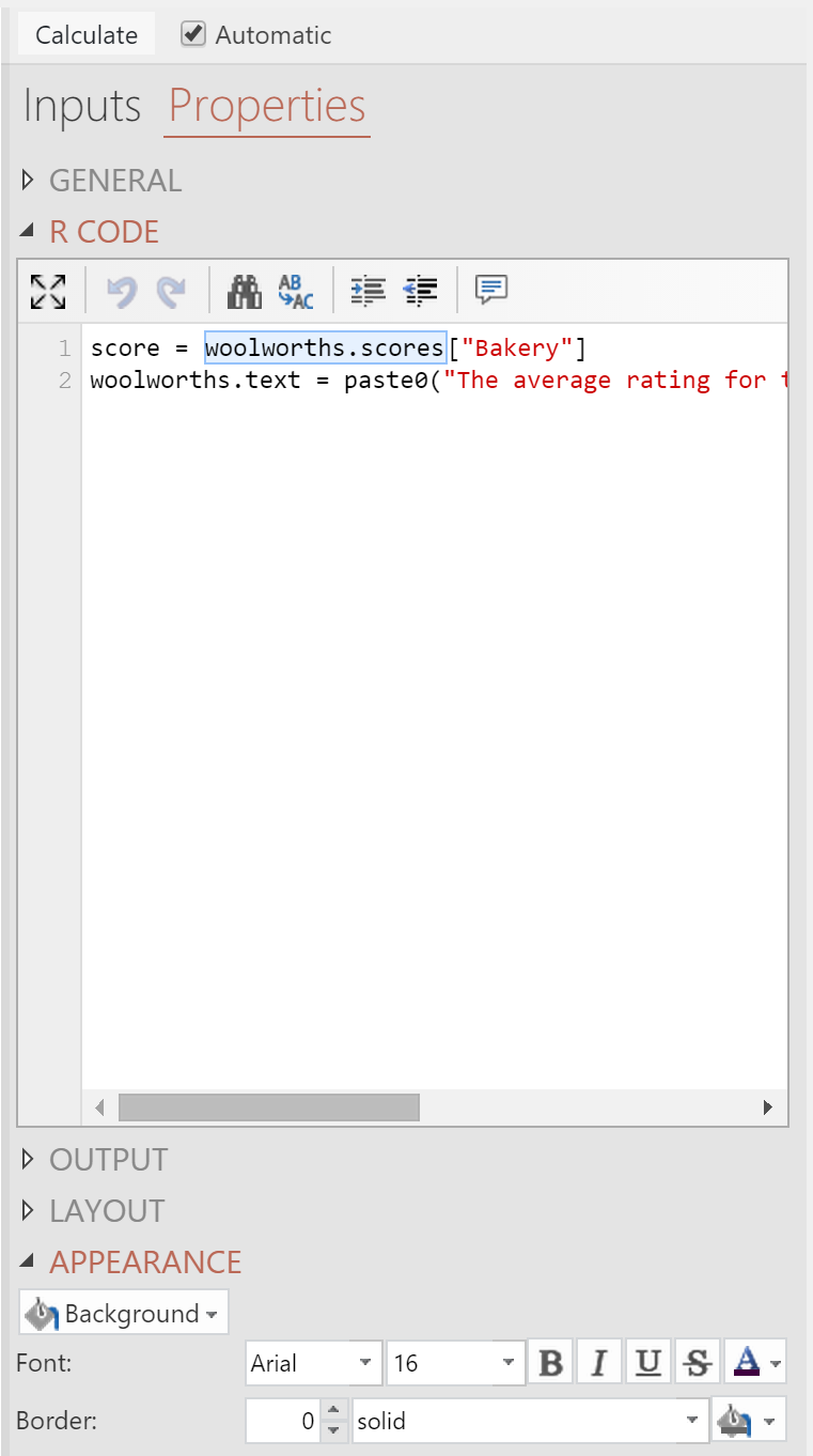
The code for my first example is:
score = woolworths.scores["Bakery"]
woolworths.text = paste0("The average rating for the Woolworths Bakery this month is ", round(score, 1))
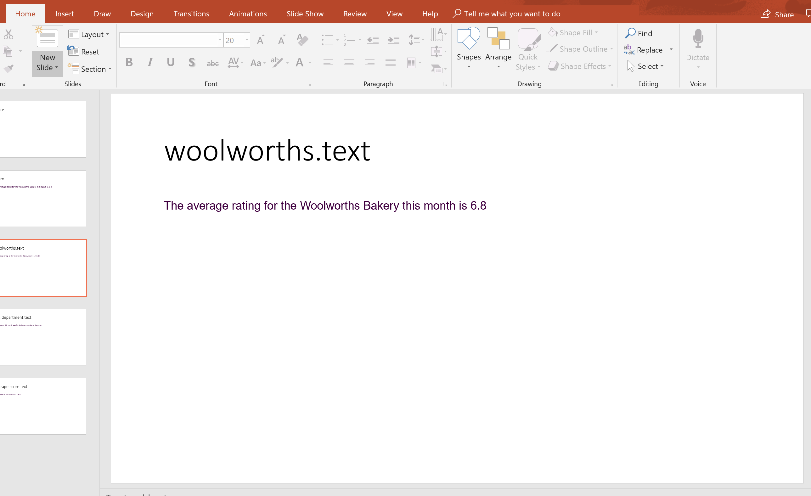
The initial appearance of the output in Q is:

In this code:
- I refer to the table containing my scores using its Reference Name, woolworths.scores. In the screenshot below you will see that this name gets highlighted in blue, which is Q’s way of telling you that it has identified a table with the specified name.
- I get the score from the Bakery row by referring to its label within the square brackets. For more on how to refer to parts of tables, see How to Do Simple Table Manipulations With R in Q.
- I use the function called paste0() to combine some descriptive text with the score that I have obtained from the table.
- I use the round() function to round the score (otherwise you’ll get about 13 decimal places!)
Formatting
You can format the text in Q, or you can format it later on once you’ve exported it to PowerPoint using the normal font settings for text. Once exported, the formatting can only be changed by changing it within PowerPoint.
Formatting in Q is done using the options in the Properties > APPEARANCE section of the Object Inspector as below. You can choose font, color, size, and a few other properties.
Exporting to PowerPoint
You can export the text to PowerPoint in just the same way you export tables and charts, using the PowerPoint icon in the top toolbar. The text from my example appears like this:
From here you can:
- Click into the text box and format it. Don’t edit the text itself (that is, don’t delete words or type new ones), because Q will not be able to update it once the text has changed.
- Cut and paste the text box onto another page. You likely want to place the text next to charts and other results.
- Resize the text box if needed.
Updating
When you get new data for your study, you can update your Q project by selecting File > Data Sets > Update, choosing the data file you are using, and then choosing your updated data file. Your table will update, and so too will the text output you have created (assuming you left the Automatic box ticked).
Then, to update the text in your PowerPoint:
- Open your PowerPoint file. The file needs to be open so Q knows where to look.
- Select the text output in Q.
- Do the PowerPoint export again.
- Click the Update button when prompted.
Updating only replaces the text, it does not change anything about formatting. This means once exported, formatting must be done in PowerPoint.
Other examples
With R, the sky is the limit. Here are a couple of examples of little extras you might like to get from your text.
Sorting and reporting the top score
This example takes the table of scores, sorts them, and reports the department with the highest score:
scores = woolworths.scores
scores = scores[1:(length(scores) - 1)]
scores = sort(scores, decreasing = TRUE)
top.department = names(scores)[1]
top.score = scores[1]

top.department.text = paste0("The top score this month was ",
                             round(top.score,1),
                             " for ",
                             top.department,
                             ".")
![]()
In this code I have:
- Removed the last score, which is for the SUM row in my table, using scores[1:(length(scores) – 1)]. You can skip this step if you hide the SUM in your table.
- Used the sort() function to sort my scores from highest to lowest. Now, the first element, indexed using scores[1] corresponds to the largest score.
- Used the names() function to get the names of the departments for each score.
Reporting the average of the scores
This example calculates the mean of the scores in the table.
scores = woolworths.scores
scores = scores[1:(length(scores) - 1)]
average.score = mean(scores)

average.score.text = paste0("The average score this month was ",
                             round(average.score,1),
                             ".")

In this code I have used the mean() function to compute the average of all the scores in the table (except the SUM, which I have removed in the same way as the previous example.
Discover more tips about Using Q or grab your free one-on-one demo with an expert market researcher!