
Histograms may look like bar charts, but they plot data in an entirely different way. While bar charts depict the frequency of occurrences, or averages, histograms plot the distribution of numeric data. So instead of groupings that represent the number of occurrences for specific categories, histograms group responses into “bins” to illustrate the “shape” of the data. In this post, I’ll show you how to build and modify histograms in Q using the Chart menu and the Visualization menu.
Creating a histogram using the Chart menu
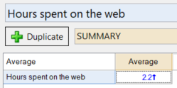
The most direct way to create a histogram in Q is through the Chart menu. To create a histogram, you will need a continuous data source, either as a single continuous variable or as a crosstab. In this example, I have created a table from the question Hours spent on the web by placing it in the blue drop down.
To turn the table into a histogram:
- Select Create > Charts > Chart.
- Select the image under the Histogram section.
- Choose your formatting options from the Object Inspector (the panel on the right-hand side of the screen).
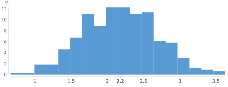
The example below shows 25 bins, but you can use the Object Inspector to adjust the number of bins and formatting. This histogram shows that the bulk of the responses roughly fall between 1.5 and 3.
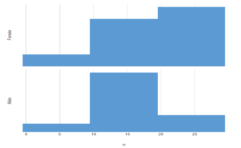
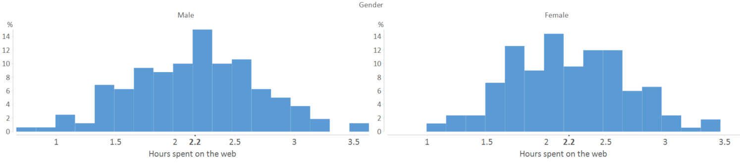
 When using a crosstab, Q will generate a series of histograms based upon the response options. In this case, I’ve crossed the Hours spent on the web question with the Gender question.
 A key advantage of using this histogram tool is that you can use it to create categories based on the distribution. To do so, click the Create Categories button at the bottom of the output. For more information, see Histograms and Creating Categories for Percentiles.
Creating a histogram using the Visualization menu
You can also create a histogram by accessing the Visualization menu. While all the Visualization menu items can work with both tables and variables as inputs, the goal of a histogram is to depict the distribution of raw data, so you’ll usually want to use one or more variables as the inputs.
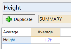
In this example, we will create a histogram that plots the question Height (placed in the blue drop down), using this variable as input. The table will show the average value of the heights of the people in the data. It can also tell us other summary statistics like the standard deviation, maximum and minimum values. However, to really see the distribution of the heights of the people in the data we use a histogram.
- Select Create > Charts > Visualization > Histogram.
- Click Inputs > DATA SOURCE > Variables in the Object Inspector on the right, and select your variable from the list.
- Click Automatic. This ensures the chart will re-draw itself whenever the input data changes or you change any chart settings.
- Change formatting options in the Chart section of the options on the right.
This yields the following histogram:
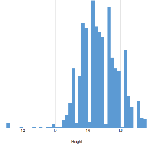
As you can see, Q has organized this data into multiple bins. If you wanted to adjust this, controls for the bin sizes are available in the Chart section of the Object Inspector. For instance, if we change the number of bins to 20, we get the following histogram.
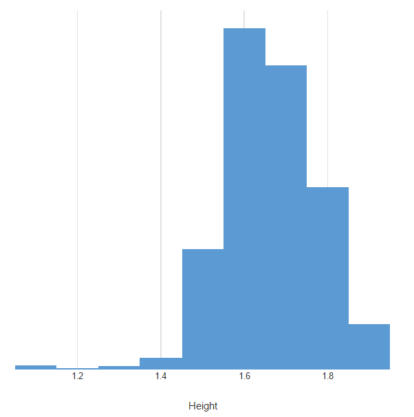 While the shape of the data remains mostly the same, we can now see a smoother distribution of frequencies and bins that all contain frequencies.
Utilizing the visualization version of a histogram also allows for alternative data structuring. For instance, you can change the plot to vertical instead of horizontal. You can even switch to a cumulative histogram, that uses a running total of the frequencies instead of discrete counts.


