Tables of two dimensional data can be hard to read if there’re a lot of cells in them. Picking out trends and spotting differences over time can get tricky. Line or area charts don’t always give a good idea of differences in actual proportions. Enter the radar chart, which can provide a great alternative.
A radar chart is effectively a line (or area) chart wrapped around a central axis. What would ordinarily be your y-axis will go outward from the center of the chart. The x-axis will go around the outside of the chart in a circle, starting at the top and then in a clockwise direction. As with all visualizations, though, we need to have some data before we can do anything at all.
Setting up data to chart…
I found an amusing data set containing records for individual UFO sightings between 1901 and 2020. No, it’s not imaginary data, there’s just no recorded sightings for the last couple of years. The data came in .csv format, and I loaded it into Q by using the automatic detection of question structures. From this I created a table where I put the date of the UFO sighting in the blue drop-down. In the brown drop-down I placed the reported shape of the flying object. There were a lot of shapes with very low reported numbers. To get rid of them, I selected those columns, right-clicked, and then chose the option Hide. Here’s the table I ended up with:
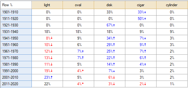
This is a fairly small table, and some differences are already apparent. We can already see that some shapes become more or less popular over time. I want to see this graphically, however, so it’s time to turn my data into a radar chart.
…and creating the radar chart
To create a radar chart in Q, go to Create > Charts > Visualization > Radar Chart. This will bring up the Object Inspector on the right-hand side of the screen. You should, in the drop-down Inputs > DATA SOURCE > Output select the table we created above. Tick the Automatic box, which will ensure the chart calculates if you make any changes to the settings or to the underlying data. A radar chart will magically appear on screen, looking something like this:
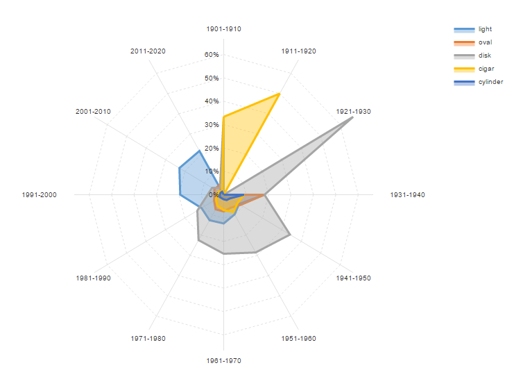
It has some issues. First of all, there are a couple of odd spikes in the early parts of the 20th century. A closer look at my data reveals that in a data set of about 80,000-odd cases, less than 10 occur in this period, so to ensure that we don’t over-represent a very small number of cases, I will get rid of the first three time periods from my chart. The easiest way to do this, is to add the labels to the Inputs > COLUMN MANIPULATIONS > Rows to ignore list (augmenting what’s already there), like so: NET, Total, SUM, 1901-1910, 1911-1920, 1921-1930, 1901-1910. I also much prefer a different set of colors, so I’ll change the palette used under Chart > DATA SERIES > Color palette to Rainbow. Making these changes will update the chart, giving me a much better representation of my data:
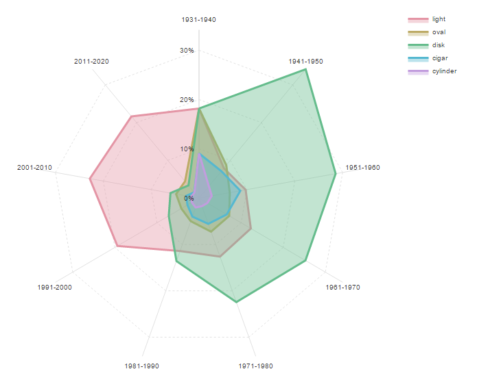
This makes it very easy to see that there’s some suspicious things happening with UFO sightings in relation to the reported shape. Between the 1940s and the 1970s, the “disk” or traditional “flying saucer” shape is prevalent. The 1980s saw an almost even number of reports between disks and lights, but thereafter, just a “light” becomes by far the most popular shape. Either the aliens have upgraded their ships, or it’s simply not credible for a UFO-spotter to report a “flying saucer” any more. I wonder what impact Hollywood might have had…
Although the palette here is pretty good at showing the different shapes through the transparent blocks of color, you may want to remove the fill. To do that, go to Chart > DATA SERIES > Opacity and change the setting to 0.0. It’s immediately easier to see some of the less frequently reported shapes and how they relate to each other. Cylinders, cigars, and ovals were clearly more popular back when UFOs were first being reported.

Ready to create web-ready charts and graphs? There are other ways to create visualizations that can be shared directly online. Check out more great options!