An area chart is based on a line chart, but with the area between the line and the x-axis shaded or colored to illustrate volume. In this post, I’ll show you how to create a regular area chart as well as a stacked area chart in Q.
Basic Area Chart
Any data series that you can plot as a line chart is also a candidate for an area chart. For an example, we’ll look at a company’s quarterly retail sales over the past 3 years from 2015 through 2017. The records in my sample data set consist of individual transactions and the information about each transaction including transaction date, customer name, units sold, transaction revenue, product sold, store location, sales associate, etc.
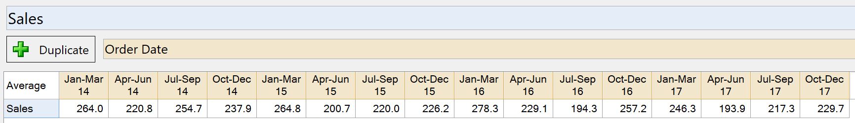
Before we can create the chart, we’ll first need to construct a data table in Q which we can use as an input for the chart. To do so, we first select the numeric Sales variable in the blue drop-down box which will return a single value representing the overall average revenue of all transactions in the data set. Next, we select the Order Date variable from the brown drop-down box to split the sales out by date. Since the default date aggregation in Q is bi-weekly, we end up with over 200 columns across 4 years of data. Since we are interested in looking at quarterly, we change this aggregation by right-clicking on any of the column headers, selecting Values and changing the aggregation from Biweekly (2 weeks) to Quarter. This gives us 16 data points (4 quarters across 4 years) for our visualization.
The next step is to create an area chart object by selecting Automate > Browse Online Library > Visualization > Area Chart. The area chart can also be found under Create > Charts > Visualizations > Area Chart. You’ve now created an area chart object in the Report Tree named chart. When you select the chart object the Object Inspector appears in the right pane. From here we select the table we created above Sales by Order Date.
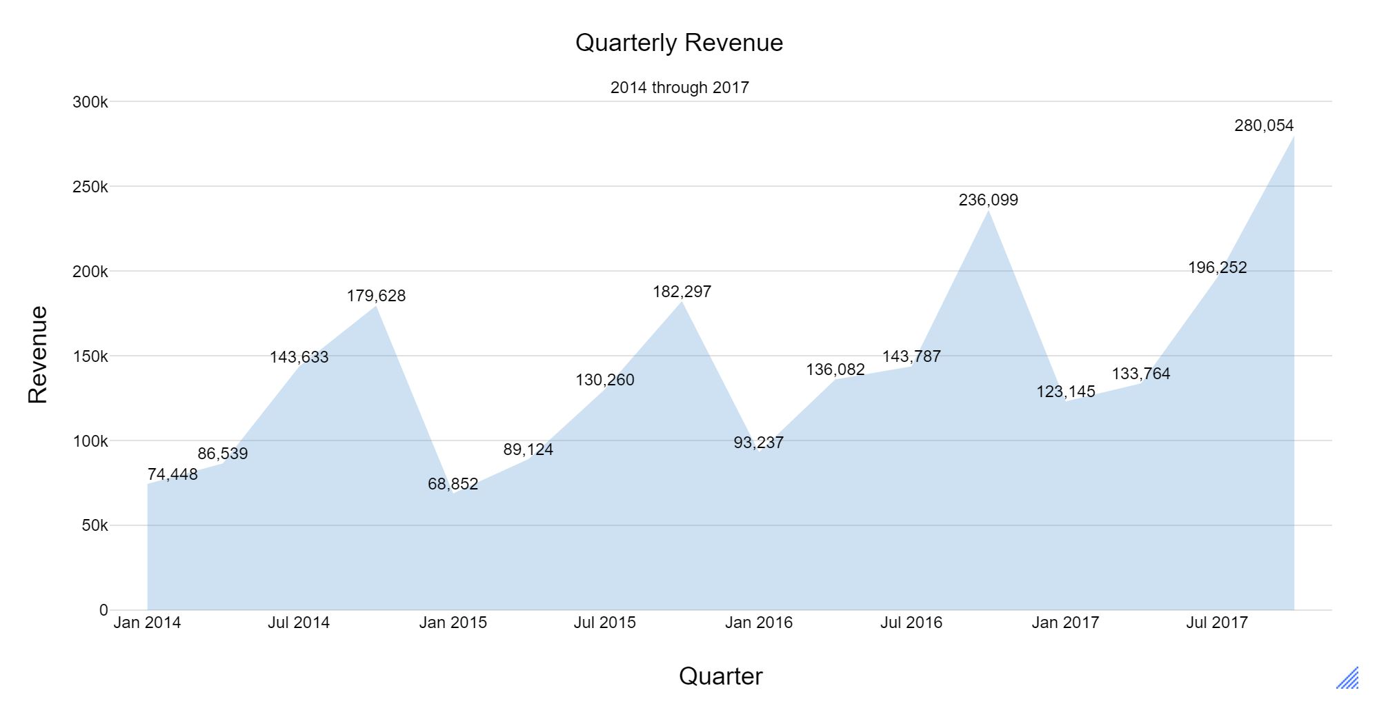
In the example above, I’ve added axis labels, a chart title, data labels and modified some of the font sizes. All of these attributes and others can be modified in the Chart section of the Object Inspector.
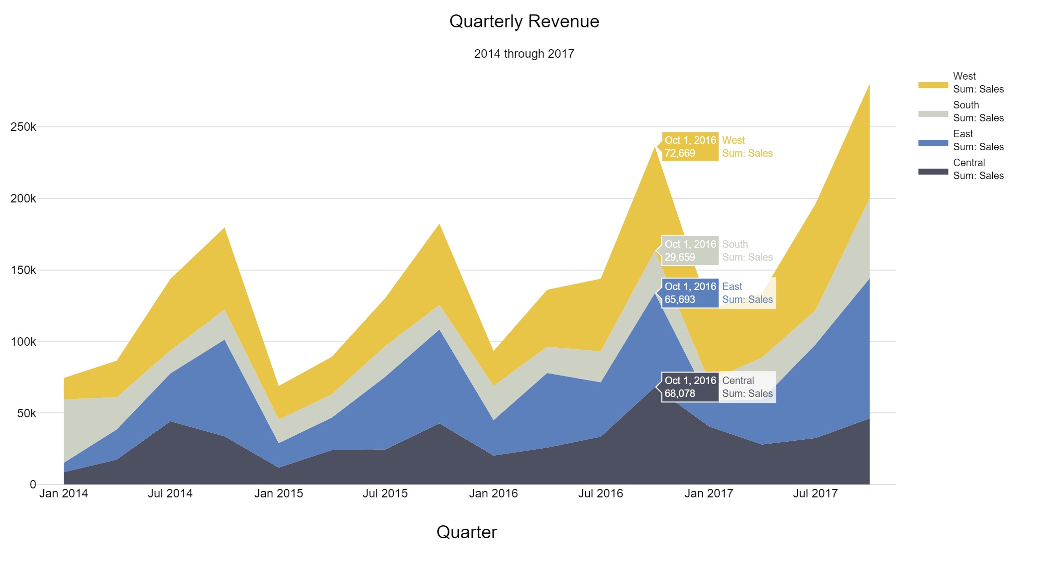
Stacked Area Chart
While single variable area charts are a nice variation on a simple line chart, the stacked area chart is a much more useful visualization. The stacked area chart allows you to see how much different components are contributing to the total. Using our retail sales example above, we’d now like to look at sales by region. Since this introduces a third variable into our visualization, a standard Q table is not sufficient. To create the necessary input table, we will turn to Q’s Multiway Table. This lets you create a table with more than two variables.
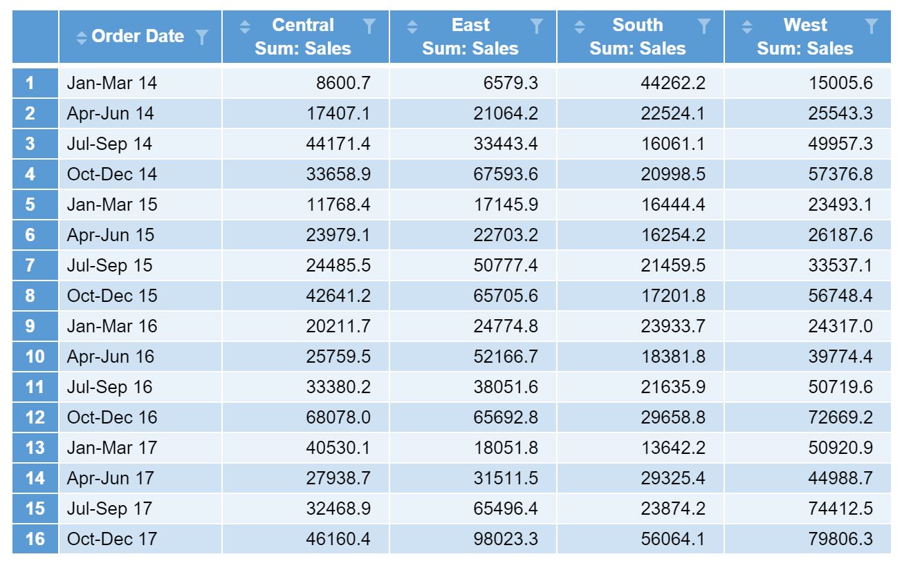
To create the Multiway Table, select Create > Tables > Multiway Table. You can also find this under Automate > Browse Online Library > Tables > Multiway Table. This creates an object in the Report Tree called multiway. From the Object Inspector, we then select Order Date for the Rows, Region for the Columns, and Sales for the Numeric value, and click Calculate to generate the following table.
In the area chart object, we can now select the multiway table as the Data Source and tick the Stack Series checkbox in the OUTPUT section. Lastly, click Calculate to generate a stacked area chart.