How to Make an Importance/Performance Scatterplot in Q
Popular amongst researchers is the importance vs. performance scatterplot. This is where you have a series of items that you place in a grid, where one of the axes is performance and the other is importance.
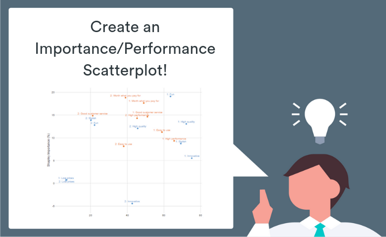
A bit like the scatterplot below:

The purpose of this post is to show you how you can easily construct this type of plot in Q. The good news is that you don’t need to use Microsoft Excel Charts to do this (because that can be a bit fiddly to set it up in Excel or PowerPoint). You can make the visualization in Q with lots of options, auto-updating, and an easy export to other tools (like PowerPoint or Displayr).
This post doesn’t touch on what should or shouldn’t be the content of your scatterplot. What defines items, performance and importance is really up for grabs – it is whatever you define it to be. Commonly, researchers have:
- items as brands, attributes, or statements
- performance as satisfaction with the item (mean or proportion) or associations of particular brand with the items mentions
- importance as either explicitly stated/rated importance of each item (in context) or perhaps a derived importance measure (such as using scores from a driver analysis or other model)
The basic process in Q
There are three key steps:
- Make two tables – one of your performance scores, the other your importance scores
- Merge the two tables into one
- Hook the final table up to a scatterplot visualization
In this worked example, we’ll use data from a survey on technology brands (available in a QPack at the end of this post). The data includes association of various technology brands (Apple, Microsoft, etc) with personality attributes, as well a likelihood to recommend scores. By regressing the items (using a Shapley Driver Analysis) on the likelihood to recommend, we can derive importance scores for each of the items. (We explore Driver Analysis extensively on this blog and in our eBooks and webinars).
Step 1: Make your source tables
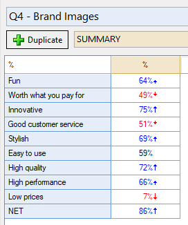
The first table is a summary table of associations of brands with personality attributes. Because this is stacked data, I’ve filtered the table by brand=Apple to produce Apple-specific ‘performance’ ratings:
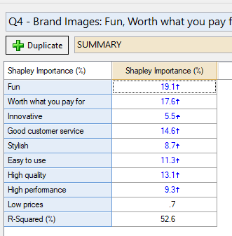
The second is a summary of a Driver Analysis (Shapley). I’ve removed the statistics for the table so it just has the Shapley Importance scores. We have the option to have results for all the brands (general model) or to filter by Apple. In this case, I’ve decided to filter by Apple as well so that the importance scores are Apple-specific.
In the next step, we’re literally going to “glue” the scores side-by-side.
Step 2: Merge the tables
- From the menu ribbon, select Create > Tables > Merge Two Tables
- Over on the right-hand side (the Object Inspector) specify the two tables above to be your input tables.
- Specify that the join direction is side-by-side
- Push Automatic (next to Calculate) – so that this table always stays up to date automatically if any changes are made to your source tables (an R output always needs to be calculated or recalculated)
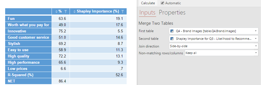
The table above is literally matching the items, meaning that it includes both the R-Squared row and the NET row from the original table. As we don’t actually want this for the purpose of the impending scatterplot, you can remove it by changing “Keep all” to Non-matching rows/columns: Matching Only.
Step 3: Create the visualization
From the menu ribbon again, select Create > Charts > Visualization > Scatterplot
Now in the Object Inspector for this output, specify the DATA SOURCE to be an Output. That Output is the merged table we just made (by default called ‘merged’ here). Again push Automatic to keep it up-to-date automatically.
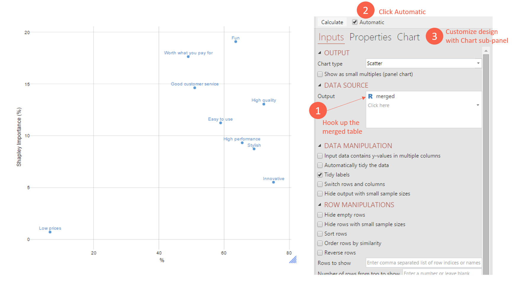
Then, to get it looking just like I have in the above image, you can customize the design options under the Chart tab of the Object Inspector. For example, I set APPEARANCE > Show Label: On Chart – so that the labels appear on the chart. There are lots of options to customize here with respect to design.
And that’s it! Now you can export to PowerPoint if you wish. The beauty of doing it this way is that the scatterplot now stays automatically up-to-date! (And no clumsy fiddling in PowerPoint).
Further customizations and enhancements
With the scatterplot, you can do a lot more than just the labels above. There is the potential to change the size of bubbles, add brand logos, and even overlay multiple tables on the one grid.
As an example, to do multiple performance/importance on the one grid, it’s as simple as hooking up multiple merged tables to the scatterplot. In the example below, I duplicated the Apple source tables, merged them, and changed their filter to Microsoft. Then I fed the second merged table into the scatterplot visualization. I also renamed the merged tables appropriately in the Report (a good piece of housekeeping!).
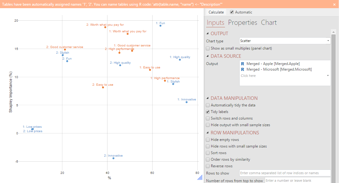
I also changed the color palette in the Charts sub-panel of the Object Inspector. Q is also giving you a note (in orange at the top) that you could have the scatterplot relabeled as Apple: Fun, Microsoft: Fun, etc, by editing the code that lurks underneath the Properties sub-panel. Although we can customize the visualization using the Object Inspector, there is great potential for further customization by editing the code.
Try it yourself
The working of the above example is captured in this QPack. We encourage you to download it to see the working and try for yourself!