The Complete Guide to Marketing Research
Basic Data Analysis
Basic Data Analysis
Once the data has been cleaned, tidied, and (if required) weighted, tables need to be created and interpreted and turned into reporting. This consists of the following steps, but they can be done in any order: summary tables, crosstabs, significance testing, and filtering data.
Summary Tables
Creating a Summary Report
- All the questions in a survey.
- All the administrative records stored as variables in the data file (e.g., the time when the interview was commenced, the time the interview took to complete, the unique ID variable of each respondent).
Examples
The basic information shown in summary tables by most programs is basically the same, other than formatting. The following two examples are from programs that are about as dissimilar as you can get: the traditional summary table is the type commonly used by professional market researchers. The second example shows a style of summary developed for less-experienced researchers.
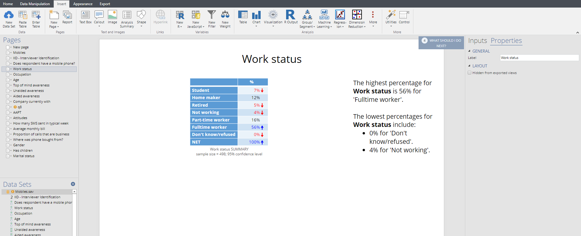
Displayr
The following screen is shown from Displayr. A separate page is created for each summary table (or, optionally, chart). All the tables are listed on the left of the screen. A text box highlights some of the key features of the table. Arrows and colors are used to highlight results that are significantly high or low.


MarketSight
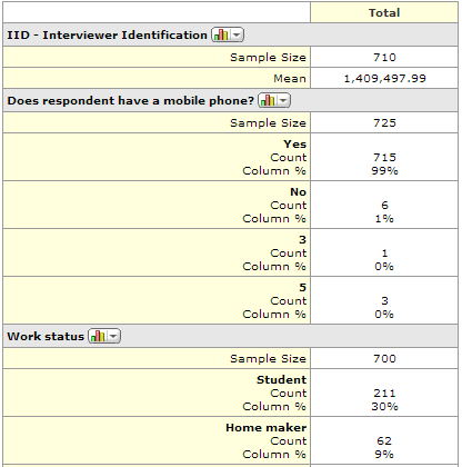
The summary developed by MarketSight lists all the variables and questions, one after another, in a large table. The main statistics that are shown on the table – the percentages and the Sample Size are the same as those shown above. Additionally, the count is shown on every table automatically.
Interpreting a Summary Report
Categorical and numeric variables
Generally, summary reports will show tables of percentages for categorical variables, such as age and gender, and tables showing averages for numeric variables. For example, in the summary report from MarketSight below we can see that the first table shows an average of a numeric variable and the second shows percentages and counts from a categorical variable.
Switching between categorical and numeric variables
In most programs it is necessary to change the metadata to switch between the average and percentages. Exceptions to this are:
- In SPSS the user specifies whether to run a mean or frequency manually for each table.
- In Q and Displayr you can change the metadata, or if it is showing a percentage you can use Statistics – Below or Statistics – Right to add averages to the table of percentages.
Multiple response questions
With multiple response questions there are a couple of different ways of computing percentages:
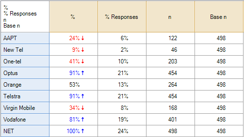
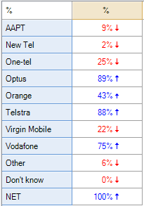
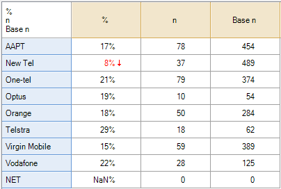
- Percentage of respondents. The % column in the table below (which was computed using Q) shows the proportion of respondents to have selected a response (e.g., the 24% for AAPT is computed by dividing the 122 people to have selected this option by the 498 people that were shown the alternative (which, in this case, was the entire sample). Generally, it is this percentage that is used when reporting data from multiple response questions).
- Percentage of responses. The % Responses value of 6% is computed by dividing 122 by the total of all of the counts (i.e.,122/(122 + 46 + … + 401)). This percentage is rarely used and is perhaps never actually useful, except as an input to data cleaning.
Multiple response summary tables with messy data
When the data from a survey is ‘neat’, all the main data analysis programs used for analyzing surveys produce basically the same results. However, there are a couple of situations where programs can produce wildly different results.
Missing values
When multiple response data contains missing values the programs produce completely different results. Please see Counted Values and Missing Values in Multiple Response Questions for a discussion of how the programs differ and for instructions for making the programs produce more sensible results.
When not everybody is in a category
In a ‘tidy’ survey everybody is forced to have an answer in a multiple response question (i.e., people are not permitted to go onto the next question without selecting at least one of the alternatives). However, there are a few scenarios when not everybody will have a response:
- When there are data integrity problems.
- When people were not compelled to select an option.
- When the multiple response question has been created by the user (e.g., if creating top 2 box scores).
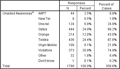
In each of these situations different programs give different results. The two tables below are computed using data where everybody in the data has selected at least one category. And, as will occur with all of the standard programs, the results are the same. That is, the percentages on the table on the left, which has been computed using Q, are the same (bar rounding) as those on the right side of the second table, which was computed using SPSS. The only substantive difference between these tables relates to the bottom row, where Q shows a NET, which is the proportion of people to have selected one or more of the options, whereas SPSS shows the total.
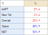
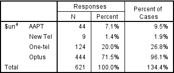
The two tables below are also computed using Q and SPSS. Further, they use the same data as used in the tables above, except that only the first four categories have been included in the analysis. Note that the Q analysis is almost the same. The percentages for each brand remain the same. The only difference relates to the NET, which is 100% for the table above, but 93% for the table below, which is because only 93% of the sample have selected one of the four brands shown. By contrast, the results for SPSS are all different. In fact, they are all about 8% higher on the table below compared to the table above. The reason for this is that it uses a somewhat strange formula. The SPSS percentages have been computed by dividing the number of people to have selected any option by the number of people to have selected one or more options. Looking at the AAPT data, in the table above SPSS shows 8.8% which is computed as 44 / 498, where 498 is the proportion of people to have selected one or more option (i.e., the total sample). In the table below, however, 9.5% is shown which is 44 / 462, where 462 is the number of people to have selected one or more of the four brands used to construct the table.
It is important to appreciate that the discrepancy between the results is caused by having data where some people have not selected any of the categories. Where the data does not suffer from this problem, the different programs will give the same results. Additionally, the difference is one of those rare instances where one of the programs is producing numbers that are, in most situations, unhelpful (i.e., the results produced by the SPSS calculation in the second table are misleading, because most people would assume that they relate to the proportion of respondents to select the option and such an interpretation is incorrect. Unfortunately, the SPSS calculation is the ‘standard’ one and is used by most data analysis programs (which have generally been written under the assumption that people are compelled to choose at least one option).
The reason that the programs do it differently
As mentioned, in situations where the NET is 100% the two methods will get the same answer. The table-based method is the traditional approach. In a traditional survey the NET will always be 100%, because in a traditional survey run by a professional researcher there would always be a ‘None of these’ option and thus both methods get the same results. Thus, the traditional programs use the table-based method because it is faster to compute when there is no missing data. However, in situations where there is a chance that the data will be messy in some way the respondent-based method is preferable as it has the advantages that:
- The possibility of a problem is flagged by the NET not being 100%.
- The values that are estimated are sensible (i.e., it is much easier to explain that the percentage represents the proportion of respondents than it is to describe the percentage as representing the proportion amongst respondents that have selected at least one option).
Thus, as many of the traditional programs are developed under the assumption that the data is relatively clean they employ a method that is best in those situations, where as the more modern programs use the alternative method as it is safer in the modern world where the data is often messy.
How to switch between the different types of multiple response computations
In most programs it is possible to get the program to change the way that it computes the percentages on multiple response questions. In programs that use the respondent-based method the trick is to filter the table so that it only contains respondents that selected one or more options. In programs that use the table-based method the trick is to not tell the program that it is a multiple response question.
Using the summary report to guide data cleaning
At a minimum, the summary report should be reviewed to check that the results make sense, which essentially involves comparing results with things that are already known about the population being studied (this is discussed in detail in Checking Representativeness), and that they are plausible (e.g., if a respondent claims to have 99 mobile phones then this suggests that there is a problem.
More thorough data cleaning involves checking that the two-way relationships between variables are sensible. For example, if checking data on firm profitability, it is useful to review the profitability per number of employees, as it may make sense for a firm to contribute 10 million dollars of profit to an industry, but it is less likely if the firm has 1 employee. This is done by creating Crosstabs. Typically, this is done as a part of the main data analysis rather than as a separate stage of data preparation.
The hard part of data cleaning is deciding what to do with “dirty” data. Consider as an example a data file that indicates that a person goes to the beach 99 times a month in summer. The options are to:
- Determine that the problem is that the metadata is incorrect. For example, it may be that a value of 99 does not represent the number of trips to the beach instead indicates that the person did said “don’t know”. See Correcting Metadata.
- Delete the incorrect value, replacing -99 with a special code indicating the data is invalid. This results in missing values and then there is often a need to use special analysis tools that can address the missing data. See Missing Values.
- Change the value (e.g., replacing 99 with 9). See Recoding Variables.
- Change the value to multiple values and assign probabilities to the different values. Although this can be the most appropriate thing to do, it is extraordinarily unusual for something like this to occur in a real-world commercial study and as such this approach, which is known as multiple imputation, is discussed no further.
- Delete the entire record of data that is dirty, which involves making the assumption that this one error indicates all their data is wrong. See Deleting Respondents.
In order to work out which of these is appropriate we need to understand the cause of the poor data (e.g., key punching errors, corrupted data, respondent error), as if we clean the data without understanding the cause of the problems, we run the high risk that other data that we have not spotted as being dirty is inaccurate and that the “clean” data does not accurately represent the market.
Crosstabs
A table showing the relationship between two questions in a survey is called a crosstab.
Reading crosstabs
The following table is a crosstab of age by whether or not somebody has a listed phone number.
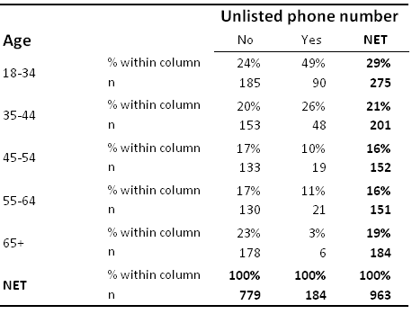
This table shows the number of observations with each combination of the two questions in each cell of the table. The numbers of observations are often referred to as the counts. We can see, for example, that 185 people are aged 18 to 34 and do not have an unlisted phone number.
Column percentages
Column percentages are shown on the table above. These percentages are computed by dividing the counts for an individual cell by the total number of counts for the column. A column percent shows the proportion of people in each row from among those in the column. For example, 24% of all people without an unlisted phone number are aged 18 to 34 in the sample (i.e., 185 / 779 = 24%) and thus we can say that based on this sample we estimate that 24% of people with an unlisted phone number are aged 18 to 24.
Row percentages
Row percentages are computed by dividing the count for a cell by the total sample size for that row. A row percent shows the proportion of people in a column category from among those in the row. For example, as 185 people are aged 18 to 34 in the No column and there are a total 275 people aged 18 to 34 the row percentage is 67% (i.e., 185 / 275) and thus we can say that based on this sample we estimate that 67% of people aged 18 to 34 have an unlisted phone number.
Working out whether the table shows row or column percentages
Some crosstabs do not clearly label whether percentages are row or column percentages (e.g., the example below). When reading a table, the easiest way to check if it is showing row or column percentages is to check to see which direction the numbers add up to 100%. In the table above, the percentages add up to 100% in each column and, furthermore, this is indicated on the table by the NET, and thus it shows column percentages.
Checking to see if the percentages add up to 100% only works where the categories in the rows (or columns) are mutually exclusive. Where the data is from a multiple response question it is more difficult, as the percentages will add up to more than 100% (as people can be in more than one category). An example is shown in the table below, which shows two different types of column percentages:
- The percentage of people to have selected each option(% Valid Cases).
- The percentage of options selected (% Total Mentions).
(See Counted Values and Missing Values in Multiple Response Questions for a more detailed discussion of how to interpret such tables).
In the crosstab below the percentages do not add up to 100% in either direction and there is nothing in the way the table is labelled to make it clear whether the table is showing row or column percentages.
In most cases when a percentage is shown on a crosstab it is a column percentage. This table shows column percentages. Where the trick of adding up the percentages does not work, as in this example, there are a few ways we can deduce whether a particular set of numbers is row or column percentages.
- The position of the sample sizes on a table. By convention, if the sample sizes appear at the top of the table then column percentages are being shown and if the sample sizes appear in a column then the row percentages are shown. In the example above the sample sizes are shown at the top, suggesting that the two percentages shown are different variants of column percentages.
- The position of the % signs on a table. By convention, if % symbol only appears at the top of each column in a table then column percentages are being shown and if the % symbol appears at the beginning of each row then row percentages are shown.
- The degree of variation in the totals of percentages. For example, in the table below we can see that the percentages vary quite a lot within each column, but within each row they are reasonably similar, which indicates that the table shows column percentages (similarly, if the variability was greater in the rows this would indicate that row percentages were shown).
Other statistics
Most commonly crosstabs show percentages. However, where the variables are not categorical, then other statistics such as averages, medians and correlations are shown in the cells of a crosstab.
Significance Tests
A significance test is a way of working out if a particular difference is likely to be meaningful or be a fluke.
Sampling error
Imagine doing a study of 200 consumers and finding that 41% said that Coca-Cola was their favorite soft drink. Now, imagine you did another study and found that in the next study 40% of people preferred Coca-Cola. And, imagine you did a third study and found that 43% of people preferred Coca-Cola. What can you infer from the differences between these studies? There are three explanations:
Explanation 1: The world changed in some way between each of these studies and the proportion of people preferring Coca-Cola dropped a little and then increased (i.e., moved from 41% to 40% and then up to 43%).
Explanation 2: The difference between the two studies is just random noise. More specifically, as each study only sampled 200 people it is to be expected that we should get small differences between the results of these. Or, to use the jargon, there is sampling error.[note 1]
Explanation 3: A mix of explanations 1 and 2.
Significance tests
A significance test is a rule of thumb that is used to help to determine whether a difference between two numbers is likely to reflect a meaningful difference in the world at large (i.e., explanation 1 above), or, is merely a fluke caused by sampling error (i.e., explanation 2).
There are many thousands of different significance tests with exotic names like Wilk’s lambda, Fisher’s Exact Test and so on. However, when analyzing survey data there is generally no need to go into such specific detail about which test to use and when as most significance tests that are applied when analyzing real-world surveys are either exception tests or column comparisons.
Exceptions tests
Consider the following chart from Displayr. Reading across the Coca-Cola row we can see that:
- 65% of people aged 18 to 24 prefer Coca-Cola.
- 41% of people aged 25 to 29 prefer Coca-Cola.
- 43% of people aged 30 to 49 prefer Coca-Cola.
- 40% of people aged 50 or more prefer Coca-Cola.
That we get different results in each of the age groups is to be expected. The process of selecting people to participate in a survey means that by chance alone we expect that we will get slightly different results in the different age groups even if it was the case that there really is no difference between the age groups in terms of preference for Coca-Cola (i.e,. due to sampling error). However, the level of preference for 18 to 24 year olds is substantially higher. In the chart below the font color and the arrow indicate that this result is significantly high. That is, because the result has been marked as being statistically significant, the implication is that the much higher result observed for the 18 to 24s is not merely a fluke and signifies that in the population at large it is true that 18 to 24 year olds have a higher level of preference for Coca-Cola.
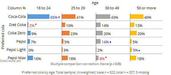
Looking elsewhere on the table we can see that: Diet Coke preference seems to be low among people aged 18 to 24, Pepsi scores relatively well among the 30 to 49 year olds and so on. Each of these results are examples of exception tests, which are statistical tests that identify results that are, in some way, exceptions to the norm.[note 2]
Now look carefully at the row for Coke Zero. The score for the 18 to 24 year olds is less than half that of the other age groups. However, it is not marked as being significant and thus the conclusion is that the relatively low score for 18 to 24 year olds may be a fluke and does not reflect a true difference in the population at large. The word ‘may’ has been italicized to emphasize a key point: there is no way of known for sure whether the low score among the younger people in the survey reflects a difference in the population at large or is just a weird result that occurs in this particular sample. Thus, all significance tests are just guides. They rarely prove anything and we always need to apply some commonsense when interpreting them.
Column comparisons
The table below shows exactly the same data from the same survey as shown above. However, whereas the chart above showed results as exceptions, this one instead shows a more complicated type of significance test called column comparisons. Each of the columns is represented by a letter, shown at the bottom of the page. Some of the cells of the table contain letters and these indicate that the result in the cell is significantly higher the results in the columns that are listed. For example, looking at the Coca-Cola row, the appearance of b c d indicates that the preference for Coca-Cola of 65% among the 18 to 24 year olds is significantly higher than the preference scores of the 25 to 29 year olds (b), the 30 to 49 year olds (c) and the people aged 50 or more (d). That the letter are in lowercase tells us that the difference is not super-strong (in the exception shown above, the length of the arrows communicates the degree of statistical significance).
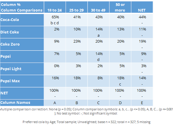
Note that while many of the conclusions that we can get from this table are similar to those from the chart above, there are some differences. For example, in the chart above we drew the conclusion that the Diet Coke preference was significantly lower among the 18 to 24 year olds than among the population at large. However, the column comparisons tell us only that the 18 to 24s have a lower score than the 30 to 49s (i.e., we know this because the a for the 30 to 49s tells us that they have a stronger preference than the 18 to 24s who are represented as column a).
Why do the two ways of doing the tests get different results? There are some technical explanations.[note 3] But all they really amount to is this: the different approaches use slightly different technical methods and, consequently, they get slightly different results. An analogy that is useful is to think about different ways of reporting news: we can get the same story reported on TV, in a newspaper and in a blog and each way will end up emphasising slightly different aspects of the truth.
The determinants of statistical significance
There are many different factors that influence whether a particular difference is reported as being statistically significant or not, including:
- The size of differences being compared (i.e., the bigger the difference the more likely it will be significant). This is exactly the same idea that is discussed on in the page on Determining The Sample Size.
- The sample size. Differences observed in larger sample sizes are more likely to be statistically significant.
- The specific confidence level of the testing.
- The number of technical assumptions that are made in the test (e.g., assumptions of normality). In the main, the fewer assumptions that are made the lower the chance that a result is concluded as being statistically significant.
- If and how the data has been weighted. The greater the effect of the weighting the less likely that results will be statistically signicant.
- The number of tables that are viewed and the size of the tables. The greater the amount of analyses that are viewed, the greater the chance of fluky results.
- How the data has been collected (in particular, what approach to sampling was adopted).
- The technical proficiency of the person that has written the software conducting the test. In particular, most formulas presented in introductory statistical courses only take into account the first three of the issues listed above and most commercial programs deal with the weighting incorrectly. The general ambiguity of statistical testing in terms of it not being able to give definitive conclusions combined with the large number of technical errors that are made in practical applications of significant tests again lead to the same conclusion presented earlier: statistical tests are nothing more and nothing less than a useful way of identifying interesting results that may reflect how the world works but also may just be weird flukes.
Notes
- Jump up↑ Or, to be more precise, sampling error is the difference between what we observe in a random sample and what we would have obtained had we interviewed in the population.
- Jump up↑ The term exception test is not a standard term. The closest there is to a standard term for such a test is studentized residuals in contingency tables, but even this is a pretty obscure term.
- Jump up↑ In particular, the exceptions test has more statistical power due to the pooling of the sample, the columns comparisons are not transitive and there are smaller sample sizes for column comparisons than for exception tests.
Correlation
Filtering
Creating filters
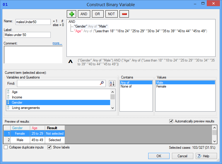
Filters are created using rules regarding which respondents should be included and which should be excluded from the analysis. While there are some nuances, generally filters are created by various AND and OR rules. For example, your rule may be to include people that are aged under 50 AND are males, or, the rule may be aged under 50 OR are males. There is no consistence between the different data analysis programs in terms of how filters are created. In SPSS, for example, filters have to be created by typing an expression. For example, a filter of males under 50 would be entered as q2 <= 7 & q3 == 1, where q2 and q3 are Variable Names and 7 and 1are specific values that represent age and gender categories respectively.
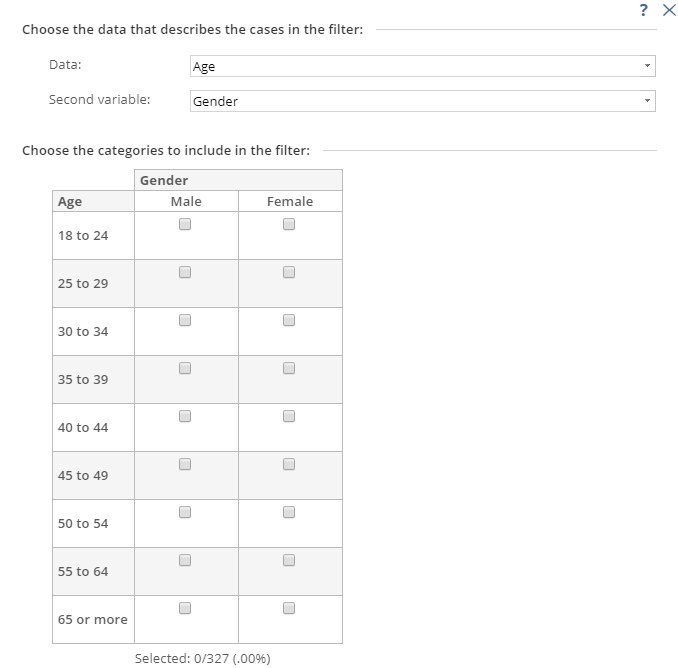
By contrast, Q instead uses the same basic logic, but presented in a ‘tree’ type format (on the left), whereas Displayr uses a less-flexible but easier-to-use grid of checkboxes.
Filter variables
Almost all programs treat the creation of a filter as being equivalent to creating a new variable, where the variable contains two categories, one representing the people in the filter and one representing the people not in the filter group. Typically, these are added to the data file allowing them to be re-used.
Applying filters
Once a filter has been created it can usually be re-used by selecting it from a list of saved filters. The only prominent exception to this is SPSS, in which you need to create a new filter but can do so by using the older filter (e.g., if the previously-created was called var001 then the expression for the new filter if re-using it would be var001. Another difference between SPSS and most programs is that in SPSS a filter is either on or off, whereas in other programs the filter is specifically applied to separate analyses.
Counted Values and Missing Values in Multiple Response Questions
Counted values
In a single response question it is usually obvious that the correct way to compute the proportions is to compute the number of people that selected a category and divide this by the total number of people that selected at least one category. At an intuitive level it makes sense that percentages of multiple response data would be computed in the same way. However, the way that data is stored prevents it from being quite so simple. Usually, multiple response data is stored so that there is one variable for each brand. However, it is not always clear how to analyze this particular variable.
In some data files the code frame will be set up as:
0 Not selected
1 Selected
In such a situation it is usually pretty obvious that the correct way to compute the proportions is to work out the proportion of people with a 1 in their data (it gets more complicated if there is missing data; this is discussed in the next section). Or, phrasing it in a different way, the correct way of computing the proportions is to count the higher value (i.e., the 1).
Similarly, if there is no metadata and the variable only contains 0s and 1s it is still obvious that the 1s should be counted.
However, where it gets complicated is when there are values other than 0 and 1 in the data. For example, sometimes the code frame will be:
1 Yes
2 No
To a human being it is obvious at the Yes responses should be counted. However, in one sense, this is the opposite to the previous examples, as now we are counting the lowest of the observed values rather than the highest.
Due to the potential ambiguity, the way that most programs work is that they either force the user to specify a specific value (e.g., SPSS requires the user to specify the Counted value), or, they give the user the ability to inspect and modify the setting. For example, in Q the user specifies whether the analysis should or should not Count this value and in Displayr the user has the option to Select Categories.
Multiple response data where the variables contain multiple values
Sometimes the variables contain more than two values, so it is not at all obvious which of the values should be counted. There are two very difference instances of this.
Case A: Max-Multi data
If the data is in max-multi format then different options need to be selected at the time of creating the multiple response set.
In SPSS, for example, the data needs to be selected as Categories when defining the multiple response sets, whereas in Q there is a special question type of Pick Any – Compact designed for this type of data.
Case B: Recoding grid questions
Often it is useful to treat some types of grid questions as if they are multiple response questions. Most commonly, with a question that gets people to rate agreement using five points (e.g., Strongly disagree; Somewhat disagree; Neither agree nor disagree; Somewhat Agree; Strongly Agree it is common to turn this into a top 2 box scores (i.e., the NET of Somewhat Agree and Strongly Agree. There are numerous ways of doing this. However, the simplest is to treat the data as being multiple response and count multiple values. For example, count the 4 and 5 values (assuming they correspond to Somewhat Agree and Strongly Agree). This can be done in most programs by recoding the existing variables so that they have only two values (E.g., 0 and 1) and then treating the data as if from a multiple response question. In the case of Q and Displayr they both permit the specification of multiple counted values (i.e., there is no need to recode the variables in these programs).
Missing values
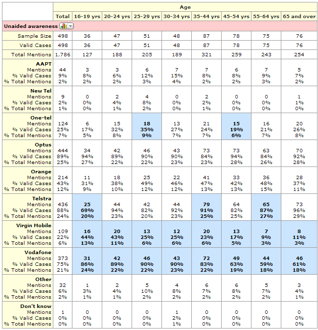
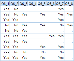
The following table shows the data for the first 10 of 498 respondents from the Mobiles Example. Note that, for example, the first respondent has only provided data for brands 1, 2 and 7 (i.e., has missing values for all of the others). This data is from a question where people were presented with a list of brands and asked which they had shown before (i.e., it is an Aided Awareness question). Where respondents have missing values (shown as a .) this is because they had indicated in an earlier Unaided Awareness question that they were aware of the brands.
The only way to compute a valid summary table of this multiple response question is if the data has been set up so that the analysis program knows that the correct interpretation is that a person is aware of a given brand if either they have said Yes, or, they have missing data. By default no analysis program will work this out. For example, the resulting summary tables in SPSS and Q are shown below. Both are incorrect in this instance.
| SPSS multiple response summary table with missing data | Q multiple response summary table with missing values |
|---|---|
 |
 base n = 0 to 489 base n = 0 to 489 |
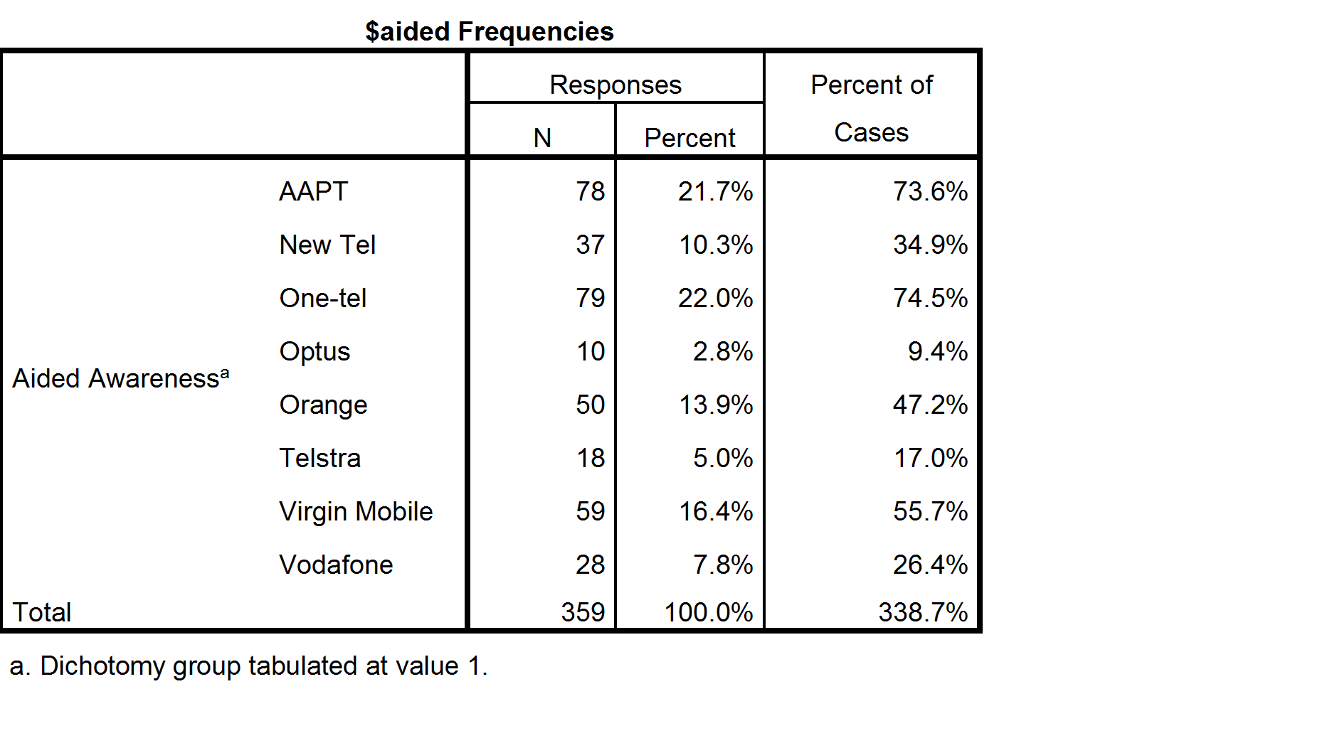
To better understand the data and how to compute valid percentages it is helpful to look at the following table, which indicates the number of respondents to have data of Yes, No or Missing data for each option. Looking at the SPSS table above, the 21.5% shown for Responses AAPT has been computed by dividing the 78 people that said Yes for AAPT by the total number of Yes records for all the brands. Less obviously, the 71.6% shown for Percent of cases has been computed by dividing 78 by 106, where 106 is the number of people to have a Yes response response in the data for at least one of the brands (this number is not shown on the table and cannot be deduced from the table). In the presence of missing data neither of these statistics has an useful meaning (i.e., they are not estimates that relate to the population of phone users).
The table computed by Q (above and to the right) shows 17.6% for AAPT. This has been computed by dividing the 78 by the total number of people to have said either Yes or No for AAPT (i.e., 17.6% = 78/(376 + 78)). This percentage does have a real meaning which is useful in some contexts. The interpreation is that 17.6% of people asked whether they were aware of AAPT said they were aware. However, in this specific example, where we know that everybody with missing data was aware of AAPT, Q’s default calculation is also unhelpful.
| Missing data | No | Yes | Total | |
|---|---|---|---|---|
| AAPT | 44 | 376 | 78 | 498 |
| New Tel | 9 | 452 | 37 | 498 |
| One-tel | 124 | 295 | 79 | 498 |
| Optus | 444 | 44 | 10 | 498 |
| Orange | 214 | 234 | 50 | 498 |
| Telstra | 436 | 44 | 18 | 498 |
| Virgin Mobile | 109 | 330 | 59 | 498 |
| Vodafone | 373 | 97 | 28 | 498 |
| Vodafone | 373 | 97 | 28 | 498 |
| Total | 1753 | 1872 | 359 | 3984 |
With this type of data the correct calculation is to compute the aided awareness as the proportion of people to have said Yes or having missing data and divide this by the total number of people in the study. In the case of AAPT, for example, the correct proportion is 24.5% (i.e., (44 + 78) / 498). The following table shows the correct proportions for all of the brands:
| Brand | Aided Awareness |
|---|---|
| AAPT | 24% |
| New Tel | 9% |
| One-tel | 41% |
| Optus | 91% |
| Orange | 53% |
| Telstra | 91% |
| Virgin Mobile | 34% |
| Vodafone | 81% |
Using software to compute the proportions correctly
The standard way to fix the data is to:
- Recode the variables so that the missing values are recoded as having a value of 1.
- If it is not already in the data, create a “none of these” alternative (this is necessary because SPSS and some of the older analysis packages require that each respondent has at least one Yes response in order for the percentages to be correctly calculated).
The standard method can be done in Q and Displayr as well, but both of these programs have an easier way of fixing this problem.
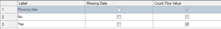
Computing the correct proportions in Displayr
- Select a variable set which corresponds to a multiple-response question under Data Sets.
- On the right, select Properties > DATA VALUES > Missing Data, select Include in Analyses for each of the categories and press OK.
- On the right, select Properties > DATA VALUES > Select Categories and ensure that Yes and Missing data are selected and press OK.
Computing the correct proportions in Q
- In the Tables tab, right-click on one of the categories of the question and select Values.
- Fill in the dialog box as shown below.