
Web scraping (also referred to as web data extraction or web harvesting), is the process of using software to fetch the contents of a web page and extract information from it for use in some analysis. In Q, you may want to add a visualization or analysis of some web-based data to your report to supplement the results from your survey. In this article I show you how to use the rvest package in R to bring in some data from a web page, and then connect that data to a visualization.
In this article I will extract some data stored on a Wikipedia page. The data shows the top companies by revenue, and it is contained in a table on the Wiki page.
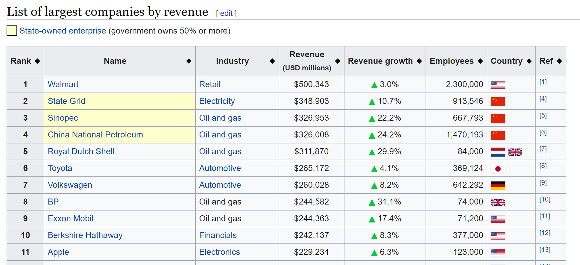
This is a relatively simple version of web scraping, because it only requires me to obtain a single web page and locate and store a single element of the page. Even better, the data itself is already quantified and tabular.
Web scraping can be more ambitious than this. With purpose-built software, or R packages like rselenium, you can automate the process of navigating through a sequence of web pages, scraping data as you go. Alternatively, many web applications like Facebook and Twitter provide APIs, which is to say that you can write code to draw in data directly from their databases, rather than scraping from their web pages.
Obtaining the data
For small examples like this, we can use an R Output to add a table of data to our report. If the data set is large enough, or you want to take advantage of Q’s tables and other features, an R Data Set (File > Data Set > Add to Project > From R) will allow you to add the data in the same way that you would normally add your survey data file.
In this example we will add the table of data as an R Output:
- Select Create > R Output.
- Paste the below code into the R CODE field.
- Click Calculate.
The code I use in this example is the following.
library(rvest)
library(readr)
# Reading in the table from wikipedia
page = read_html("https://en.wikipedia.org/wiki/List_of_largest_companies_by_revenue")
# Obtain the peice of the web page that corresponds to the "wikitable" node
my.table = html_node(page, ".wikitable")
# Convert the html table element into a data frame
my.table = html_table(my.table, fill = TRUE)
# Move the company names into the rows of the table
row.names(my.table) = my.table[, "Name"]
# Remove columns not needed
my.table = my.table[, -c(2,7,8)]
# Convert dollars and percentages into numeric values
my.table[, 3] = parse_number(my.table[, 3])
my.table[, 4] = parse_number(my.table[, 4])
my.table[, 5] = parse_number(my.table[, 5])
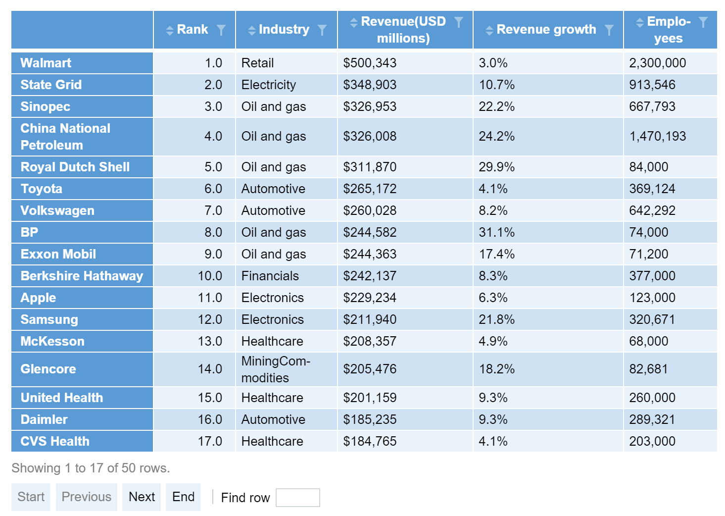
my.table
This code produces a table containing the data from Wikipedia.
In this code I have:
- Loaded the rvest package, which has functions for dealing with web pages (and also introduces functions from the package xml2 that are also handy for processing html).
- Used the function read_html to obtain the html for the web page.
- Used the function html_node to obtain the part of the web page that corresponds to the table element (called .wikitable)
- Used the function html_table to convert the html table into a data frame.
- Used row.names to move the company names from the body of the table into the row names. This makes for easier labeling in visualizations later on.
- Removed columns for the company names, country, and reference (“ref”).
- Used the parse_number function from the readr package to convert the dollar values, percentages, and comma-formatted numbers into true numeric values.
Creating visualizations
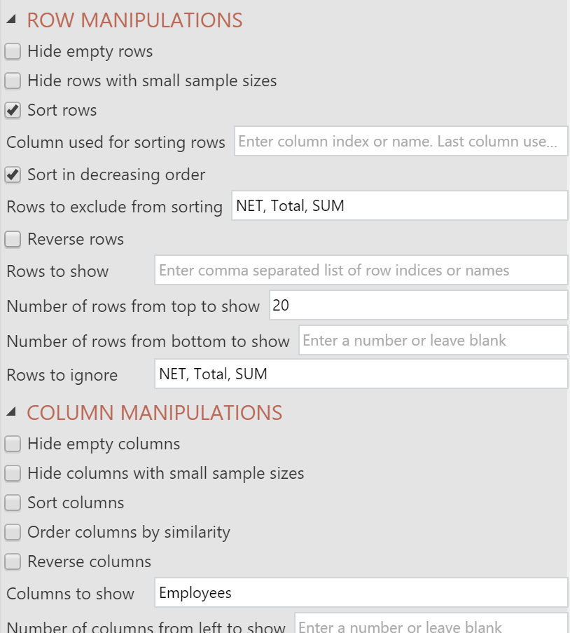
We can visualize parts of this table really easily with the options in Create > Charts > Visualization. I’ll use a bar chart, and I will use the options to select, sort, and show the parts of the table that I am most interested in. The steps are as follows:
- Select Create > Charts > Visualization > Bar Chart.

- Click on the Outputs box under Inputs > DATA SOURCE in the Object Inspector on the right, and select the table created above.
- Click into Inputs > COLUMN MANIPULATIONS > Columns to show and type Employees. This means my bar chart will show the number of employees for each company, and it won’t try to plot the other columns from the table.
- Tick Inputs > ROW MANIPULATIONS > Sort rows and Sort in decreasing order. This automatically sorts the companies according to the number of employees.
- Change Inputs > ROW MANIPULATIONS > Number of rows from top to show to 20. This lets me present the top 20 companies according to the number of employees.
- Tick Automatic. The ensures any changes in the data or the chart will be reflected automatically.
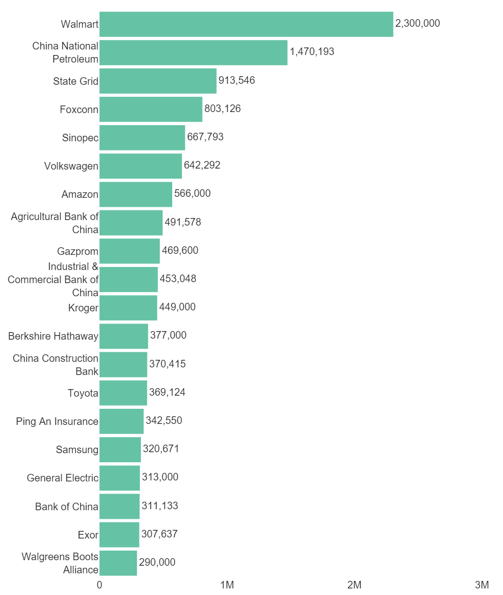
I’ve also changed fonts, labels, and axis properties in the Chart section of the Object Inspector. My chart looks like this:
With a little R code, it’s easy to supplement your report with some data scraped from the web!