Visualizations bring the relationships in your data to life through engaging graphics – all at the tip of your fingers in Q5.
These visualizations are made possible through the power of R, which is a language that is now fully integrated within Q. The good news is, you don’t need to know R code to make them: Q takes care of all that in the background!
These visualizations live under Create > Charts > Visualization.
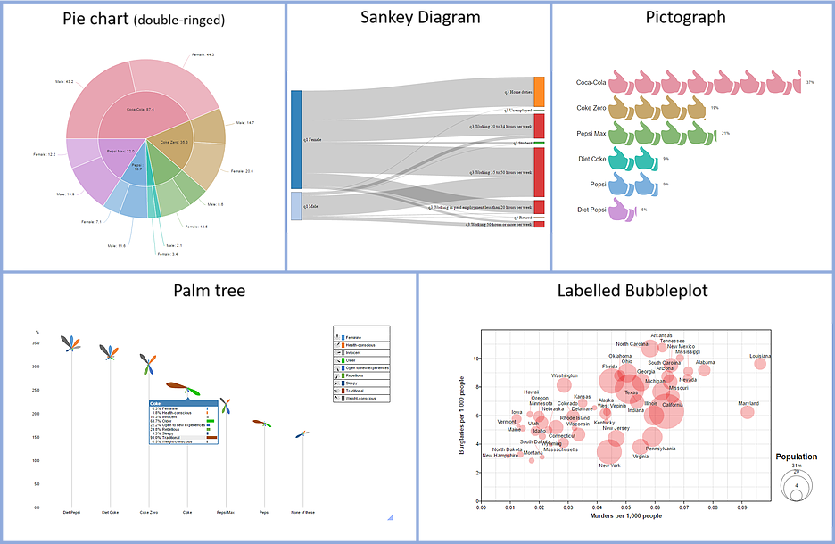
Here’s a peek at some of the new visualizations:

So how do you make them?
If you’ve made a chart in Q before, making a visualization is a slightly different process. The key difference is that (in most cases) you make a table of the data separately to the visualization and it stays separate. You then just need to hook it up it to the visualization.
Here’s how you do it in 5 simple steps.
Step 1: Create your table
-
The table can be either a standard Q table (using the blue and brown drop-down menus), or a table created in R (for example, by using Create > R Output).
-
Most of the new visualizations require a table of numbers (the exception being the Sankey Diagram).
Step 2: Select your visualization
-
Go to Create > Charts > Visualizations, and choose from the list of visualizations.
-
The new output will appear in your Report, and the options will be shown on the right-hand-side of the screen.
Step 3: Hook up the table and calculate
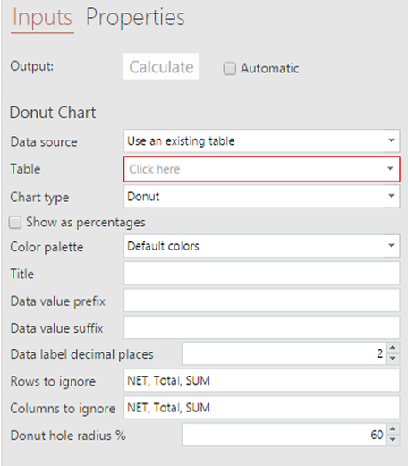
-
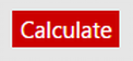
When the mandatory fields have appropriate input, they will no longer be highlighted, and the Calculate button at the top will turn red: click it.
-
Q then generates the visualization.
-
You will notice the name of the visualization in the report tree turns from grey to black. This indicates the R object (the visualization) is up-to-date.
Step 4: Customize it
-
There are several boxes and drop-down menus for you to customize your visualization.
-
The main options that can be customized are available in the menu (e.g. color scheme, scales, type of analysis and statistical assumptions). Further options can be changed by editing the R code.
Step 5: Re-calculate it (if need be)
-
Anytime you make the visualization out-of-date, it turns its name in the report tree grey. This tells you that it needs to be updated.
-
If you are feeding a table into the visualization, then any changes made to the table will make the visualization “out-of-date”.
-
Likewise, if you change any of the drop-down menu options (called Parameters), then this will also make the visualization “out-of-date”.
-
-
To update it, you simply push the red Calculate button again at the top of the visualization’s right-hand panel.
-
You can set the re-calculating to “Automatic”, to save you having to remember to push Calculate again.
And that’s it! Now you can play around with resizing your visualization in the output area. Don’t forget that R-based visualizations have interactive features that respond to your mouse (e.g. highlighting areas, dragging and clicking things).
In the next post on visualizations, we’ll look at how you can paste data directly into a visualization (so you don’t need to build a table separately). This can be very useful for particular visualizations, such as the Labelled Bubble Plot (depicted above), or when you want to quickly integrate other data (e.g. with data from sources outside your data file, such as sales data).